I was going to redo my motovational poster again, mostly becuase alot of people liked the photo(or at least they thought it was ok) but didnt care for the look of the text. So I am looking for tips on how to do text better in Photoshop.
Did you read DrAchoo's advice on not resizing text? That looks to be what the problem is; it's too pixelated.
Yes, I did read his advice on not resizing the text. I was looking for more advice on the text portion. I am just looking for others Ideas on how to improve it as well.
I also am trying to figure out if I should add text before resizing for the challenges or after.
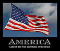
This was the entry:
This is a new one (different because I am at work):
It looks like on the new one you squashed the text, which makes it look less professional. Also, white on black with such a bold font is a bit too "in-your-face" for my taste.
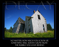
In this one I added the text after resizing, I will play with fonts eventually but want to be able to sucessfully add font before getting fancy. Here is the second one:
[thumb]591972[/thumb]
As a rule of thumb, when you are using a wide border and adding text to the bottom border, then the bottom border should be deeper than the top border by a sufficient amount to allow the text to float comfortably. Your text here is feeling cramped by its space...
As a rule of thumb, when you are using a wide border and adding text to the bottom border, then the bottom border should be deeper than the top border by a sufficient amount to allow the text to float comfortably. Your text here is feeling cramped by its space...
R.
Robert,
How would we go about doing this? Would we add to the canvas size then take a crop off of the top leaving the bottom side larger or is there another way to add to the size of the canvas without having to crop?
How would we go about doing this? Would we add to the canvas size then take a crop off of the top leaving the bottom side larger or is there another way to add to the size of the canvas without having to crop?
First do an even border the size you want the the top and sides to be. Then do a second border while checking the arrows so it is all applied to the bottom only; that is, make horizontal size zero, make vertical size however much you need, click arrow on the cell field to show where you want it to be.
It is better. I am playing a tournament in Spades right now, but when it is finished I will do another version for you to show you how I'd approach it.
It is better. I am playing a tournament in Spades right now, but when it is finished I will do another version for you to show you how I'd approach it.
R.
Thank you Robert !
I would greatly appreciate your expertize on this one.
Quick 'n dirty. I'm not 100% sold on the inline font for this, but... The main thing is the spacing, and the variation in font size from "title" and "text".
Quick 'n dirty. I'm not 100% sold on the inline font for this, but... The main thing is the spacing, and the variation in font size from "title" and "text".
R.
That looks really nice, Thanks for the attempt. I now have something I can try to mmic and try to get close to.
I had the same problem in my Motivational Poster entry. I had never used CS2 to add text to an image and found it very confusing! I did alot of swearing working on that one! I knew it didn't look quite right but I was tired of messing with it.
I also am trying to figure out if I should add text before resizing for the challenges or after.
Add the text after resizing. Bad things happen when you resample text.
R.
or write an action resizing in 500 pixel steps, down to 640. that's what i've done, and it does seem to have greatly reduced any horrid jagginess in my straight lines.
this was all done full size, then i resized in 500 pixel increments.
Robert, what font did you use for the America part? Are there other fonts you can download for photoshop?
The font is Chevalier Open. A similar font is Atlantic Inline. Any font installed on a windows machine is available in Photoshop, or any windows application that allows use of specific fonts.
Google Free windows fonts to find a gazillion of them.
Be careful with free font sites.
They may be the buggiest places on earth.
When choosing fonts remember that the eye recognizes lowercase letters much easier than uppercase, fonts with large openings are more easier to recognize than fonts with bold lines.
I try to do all work with text in Adobe Illustrator, so I don't have any help there.
Double click on the 'text' icon in the layer palette and the text will be automatically selected for you to start work on straight away. You don't need to have the 'text' tool selected to do this.
This is especially useful when you have multiple text layers.
just my two cents... photographers aren't always great graphic designers... sometimes you can partner with one and get a professional layout with nice typefaces.
just my two cents... photographers aren't always great graphic designers... sometimes you can partner with one and get a professional layout with nice typefaces.
I wasn't a good photographer or web-designer or graphic designer when I got here. Doesn't mean I haven't learned a load about all of the above.
I am really starting to feel comfortable adding text to photos in a motovational poster kind of way. A big thanks to Robert and Judi for their help and tips. Thanks to wavelength for his linkydo's. Thanks to everyone else for there help and comments in this thread.