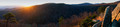
At home (on my 24 inch monitor) this picture is detailed, but still on the dark side.
On my cellphone (7inch screen) it looks ok, but not impressive. The sun is nice.
On the laptop at work it's really not good looking. I gave you a 6 when I voted at home. probably lower if voted at work.
about the image itself, I believe it should be nice to include more sky. The panorama is very large but only the left and right part are interesting.
I think that 5.5 is a fair score for the image
I think the sun flare overwhelms the image. I did a rudimentary edit removing the sun and darkening the sky and it allowed the eye to pay more attention to the foreground elements. I also think the backlit trees needed to be a bit brighter / sharper. I'm not sure the sky edit would be legal in Advanced, however. For the record, you got a 6 from me.
In general, there's really not much happening in this image. It's a very decent piece of minimalism, and the rock on the right is very tasty, but overall it just kind of sits there and doesn't speak up at all, a wallflower sort of image, ya know? This is actually a general problem with panoramas; for the most part, they seem to rely on being wide and not much else. The best panoramas, of course, succeed as images in their own right. The blue ribbon in this challenge is a fine example :-) Indeed, the top 5 in the challenge all meet that criterion. I keep going back to them as photographs, not as panoramas, if you catch my drift?
A good example of what I'm talking about is some of those PetaPixel super hi-def images we see, where you can go deeper and deeper into them and wallow in the detail; look at them as images, all in one frame, and quite a few of them are pretty blah...
The image suffers from what I call a "context" problem. The photographer is privy to much more detail, plus the experience of capturing it, as well as any people that might be there to share the event. All of that, however, is off-camera and does not come across in the image. So the image has much more meaning for the photographer, but nobody else can see why.
The image suffers from what I call a "context" problem. The photographer is privy to much more detail, plus the experience of capturing it, as well as any people that might be there to share the event. All of that, however, is off-camera and does not come across in the image. So the image has much more meaning for the photographer, but nobody else can see why.
The image suffers from what I call a "context" problem. The photographer is privy to much more detail, plus the experience of capturing it, as well as any people that might be there to share the event. All of that, however, is off-camera and does not come across in the image. So the image has much more meaning for the photographer, but nobody else can see why.
Absolutely spot on! I can still "see it", but didn't convey it (not sure really that I could have looking at it now in retrospect).
Many of the panorama images seemed to be lacking in foreground elements - maybe that's the nature of panorama- but it still looks better when a subject draws the eye into the foreground IMHO.
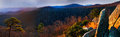
Maybe I spent too much time on the post-processing challenge (or not enough) ... But here I removed a section from the middle (including the sun) , used shadow/HL to get some of the shadows to show up, and bumped the contrast / highlights with dodge/burn.
eta: to be clear, my edit sucks. I just wanted to illustrate that i felt the sun and middle of the composition were taking attention from the cool stuff on the sides. =)
I agree with a lot of what has been said, in particular Da Bear and Johanna's comments. My own feelings as I voted on it were that I wanted more, vertically. The image is so long with comparison to its height (over 4:1) that I felt like I was looking through a slit. I'd specifically like a little more sky, and some additional foreground. The foreground may have been problematic, I don't know what was there, but given the rocks at right it would seem that there might have been some things that could have added interest in the image.
With regard to the "dark" comments, I too agree that the near side of the mountains in shadow is quite dark, and that perhaps could have been rectified by judicious lifting of the shadows, or by taking an additional set of exposures (HDR).
I agree with a lot of what has been said, in particular Da Bear and Johanna's comments. My own feelings as I voted on it were that I wanted more, vertically. The image is so long with comparison to its height (over 4:1) that I felt like I was looking through a slit. I'd specifically like a little more sky, and some additional foreground. The foreground may have been problematic, I don't know what was there, but given the rocks at right it would seem that there might have been some things that could have added interest in the image.
With regard to the "dark" comments, I too agree that the near side of the mountains in shadow is quite dark, and that perhaps could have been rectified by judicious lifting of the shadows, or by taking an additional set of exposures (HDR).
Had the camera set to the wide Panorama setting I think (would have to go back and look) ... AND I worked really hard to get that tree on the left and the rocks on the right. NUMEROUS takes to get it "just right". :-D Those were my "foreground" elements at the time ... I'm standing on some boulders to get the view, maybe another view point would have been better - don't know. Another thing to consider for next time. Yep - I could have massaged the shadows more. Part of the problem is that I edit in a pretty dark room so for me I "saw" something close to what I remembered at the time of capture.
I get the point (all of them) now. :D Thanks much one and all.