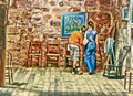
Prior to the challenge going into voting I showed this to some co-workers. I asked them, without any prompting, what their initial thought was when seeing it for the first time. Both of them said Norman Rockwell. I smiled ... thought I had it.
Then voting started and reality set in. :-)
The score was fine overall. Honestly didn't really care about the score on this one. I was really hoping to trigger some comments during the challenge voting period. I did get comments (and thank you to those that did! :) ... but not one picked up on what I was going for with the processing.
I had to look at some of his images to give you my opinion. It is interesting than many of his paintings do seem to have an HDR to feel to them. I'd say you were pretty close - but the complexity of the rocks in the background don't scream Norman Rockwell - so IMHO, it is more the environment rather than your treatment or the moment that might not connect with ppl as a NR artwork.
As I mentioned in my comment, I really like the image, but not the processing. The moment is wonderful, but what caught me was that you had an actual spotlight in the image that you didn't use to just pull you to the subject. Your processing just brought out the details in everything, distracting from the image as a whole.
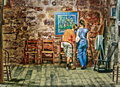
It's hard to work from a screen capture, but had you been something closer to this you'd have been in my top 3 easily.
Jake has the right idea; his PPing is good for at LEAST another full point from me. Another thing that would have helped make it sing is squaring up the "horizon", the floor/wall intersection. Rockwell was always meticulous about details like that. But back to the main issue, the processing: your "HDR" is over-tonemapped so there is NO depth at all. Rockwell knew the virtues of using light to model a scene. Wonderful image, wonderful "moment; the whole thing's achingly close to being great :-)
Good feedback! Thank you. I won't give up then. :-)
As for the lighting ... I agree, it washed out some. I also went lighter on the outside edges instead of darker (I was trying to keep the whole thing from getting too dark - NR always had a light feel to me). I struggled with that decision.
The room itself had SO many angles there wasn't a straight horizon in it anywhere! LOL This is the right half of the room ... the left side leaned a bit the other way. It actually was somewhat scary just being in the building ... didn't feel very safe. :-)
It looks like you used the top of the picture as your level, which was a smart move as I think that being off the horizontal would feel particularly bad!
This is what I mean about the perspective: Using the skew tool in PS, lower left corner DOWN and upper left corner LEFT gives me this, done on Jake's version.
This is what I mean about the perspective: Using the skew tool in PS, lower left corner DOWN and upper left corner LEFT gives me this, done on Jake's version.
Duh! Stupid, stupid, me. Of course I should have seen that ... I've certainly used that tool numerous times before. Grrr.
Some great observations from DPC folks. Any chance we can see the original (without HDR) ? Just for fun ...
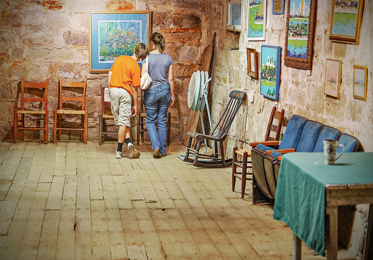
Here you go Tate (and anyone else that wants to take a shot at it). I'm a little tight on portfolio space here so I resized this down to half size 3000x2000.
Felt like playing with this - here is my quick stab at this
VERY nice!
ETA - One thing I just noticed ... I like the thumbnail view, but at a larger size the OOF table and cup in the right foreground bothers me a little (teeny-tiny) bit. :)
I'm not sure I agree with that crop. The table's an eyesore, and the coffee container on it sucks my eye. To me, it's too tight on the top also. A lot of mood is gone, for me.
I'm not sure I agree with that crop. The table's an eyesore, and the coffee container on it sucks my eye. To me, it's too tight on the top also. A lot of mood is gone, for me.
Gotta say, I'm with Bear on the original crop, but the pp'g is more Rockwellesque to me
I agree with the out of focus cup, my first try I cropped it out, but I liked this framing better after trying it again.
I even thought of replacing the cup with a dragon :)
Editing was fairly straightforward
1) In camera raw bumped the shadows to 100 and reduced highlights
2) Open in PS and follow Robert's advice on skewing the image and crop.
2) Duplicate the layer and add sharpening, Radius ~ 100px, Amount ~ 30% and change the layer blending mode to color dodge and reduce the opacity till it looked right
3) Desaturate the reds
4) sharpen, resize and save for web.