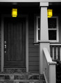
So any thoughts about my other entry - might it be better for submission in this challenge?
Maybe, just because it's simpler ... for me, both of them "suffer" from the extreme contrast between the highly-saturated subject and the very gray background, which I suspect is what has made people dislike this effect in general (see the pre-challenge discussion). For my own entry I tried to pick a subject where it "made sense" for the colored objects to be so, though it still finished well behind yours ... ;-)