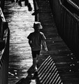
Would you really exclude all the sepia prints from the 19th century from black and white photography? Was Fuji's cool black and white film more black and white than Kodak's warm black and white, or are they both DNMC? If a challenge description leads the more literal-minded among us to DNMC sepia prints, then it should be removed. The title "Black and White" speaks for itself.
I'm with you on this one, Don. Of course, we've had folks argue that there shouldn't BE any gray tones in "Black and White" either, so we're kind of damned any which way we do it. Personally, I'd think "Monochrome" might be a better challenge title... But no matter how you slice it up, it's a little dismaying how *literal* we've become. Especially when you consider that when someone goes to the trouble of FLAGGING a challenge to require a literal interpretation, then THAT gets raked over the coals too...
Would you really exclude all the sepia prints from the 19th century from black and white photography?
With the current challenge's specific description?
Definitely!
This Black and White challenge had an additional description to it:
"Reduce the world to a palette of grays, and focus on light, shade, line, texture and form."
So... Yes. I'd exclude any image... including any ones including sepia tones (those add in a color, right? What ELSE do they do?) other than true black and true white... and their lesser values... that create the gray tones.
To me, the only ones that fit this challenge description are the ones with... NO COLORS... just lesser black and lesser white... to create tones.
If it HAD been monochromatic, then... images with a color (only ONE) would totally meet the challenge topic.
Only because the challenge description says "Reduce the world to a palette of grays, and focus on light, shade, line, texture and form."
IF the challenge had not specifically stated that the image should only be composed of grays... then yes... Images that would normally be judged as "monochromatic" would fit.
But... There WAS that challenge description.
So... I think that any other color than a shade of pure black and white gray... (Otherwise known as "gray") is not allowed.
But, that's my opinion.
And... everybody has one. *grin*
To me... the discussion is ... obviously "black or white".
Not purple. Not red. Not blue. Nor orange.
Just black or white... or a varying tone of that: Gray.
In this description, there is NO room for any color.
Only Black. Or White. Or... a lesser bit of either.
No red. No blue. No purple... No nuthin'. :D
Just black. White. Or... gray... (A tone of black)
I'm as strict a DNMC Nazi as they come, but I just don't see it in this case. If it was meant to be strictly black and white, the description would have said ONLY grays or something to that effect. Moderate sepia or blueish still fits my definition of BW and it's not the same as someone ignoring the challenge topic completely. Would we look at things like "Circles" and measure them for perfect roundness or DNMC spirals? I don't think so, but to each their own.
Would you really exclude all the sepia prints from the 19th century from black and white photography? Was Fuji's cool black and white film more black and white than Kodak's warm black and white, or are they both DNMC? If a challenge description leads the more literal-minded among us to DNMC sepia prints, then it should be removed. The title "Black and White" speaks for itself.
I was going to bring this up during voting, but refrained myself from doing so, bc I knew there would be a backlash. But I did vote on the true black and white images higher, and especially those who followed more so the challenge description;
"Reduce the world to a palette of grays, and focus on light, shade, line, texture and form." What a fool I was to follow the rules!
Challenges here are only useful, valuable, beneficial insofar as they inspire or "challenge" the photographer. Neither photographer nor voter has anything to gain by insuring that R = G = B for each pixel. It's a mathematical exercise and one that serves no good purpose. If it looks black and white, it is black and white.
(To Don's point such a clinical definition of black and white did not, could not, exist before the advent of digital photography. Scan any traditional black and white negative or print, and you'll discover that it's not truly black and white at all.)
This was the link that jagar posted in another thread.
You might say this has nothing to do with whether or not grey has color, but light certainly does. The article may explain why some here can't see that.
... If it looks black and white, it is black and white. ...
With all due respect, Sepia does not look like B&W to me. Sepia is a specific tonal treatment and isn't B&W anymore IMO.
BUT... it is a replication of a traditional B+W printing process, and is still a "monochrome" technique. Would we have claimed that traditionally-produced selenium-toned prints from B+W negatives were no longer B+W? I would submit that we would not.
I'm as strict a DNMC Nazi as they come, but I just don't see it in this case. If it was meant to be strictly black and white, the description would have said ONLY grays or something to that effect. Moderate sepia or blueish still fits my definition of BW and it's not the same as someone ignoring the challenge topic completely.
I agree. Didn't mark down for anything slightly toned. Now if it was purple toned or wicked witch of the west toning -- then I probably would have.
But having just visited the National Portrait Gallery in DC and having seen daguerreotypes by the Meade brothers and photos by Matthew Brady, these fit the definition of B&W to me. And if I wouldn't DNMC those, I'm not going to DNMC others like those in the challenge.
From the definition, I can certainly understand people choosing to be more stringent. Yet photos like those in the National Portrait Gallery, and the discussions here about Weston and the selenium type of toning, have been part of my understanding of "black and white".
So it wasn't even a conscious decision, really. I didn't even think about the description, I just voted on my understanding of black and white.
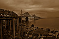
My image below was the most extreme of the type leading to this thread. There are plenty of reasons someone might want to vote it down (too dark, heavy handed processing, others as well), but to me "not B+W" just wasn't one of them. I was, as Don and others recognized, attempting to evoke a historical print, similar to those that were made when the Bay Bridge (and GG Bridge as well) were being built. I guess it just depends how you construct your Venn Diagram -- to me, monochrome (including sepia, selenium, VanDyke Brown etc.) is a subset of B+W, not the other way around. That said, I don't begrudge anyone for their vote or thinking differently, that's entirely fair. And if Kroburg's 1 point deduction is a fair estimate of how folks debited the image, I am just fine with that, as a mid-to-high five score is about what I think this image rates, and perhaps would have got there in a differently-titled challenge.
I routinely use sepia or selenium toning to enhance the effectiveness of my black and white images. There is no reason to exclude toned images from untoned images in a black & white challenge. This is yet another example of DPC voters narrowing down the definition of a challenge more than was originally intended. Voters should focus on the caliber of the photography and worry less about DNMC for a frivolous reason.
Using warm colours/tones in B&W and say there's no reason to exlude them as B&W is just one opinion.
When I have a look at the definition of black & white according to Oxford Dictionaries (the one I normally use), it says:
1. (Of a photograph, film, television programme, etc.) in black, white, shades of grey, and no other colour.
Therefore I think DPC voters who judge the images accordingly are not narrowing down the defenition. As so many things on DPC, photographers interpret the rules when making the picture, and the voters do the same. As long they do it consequently, no problem.
Couldn't resist ... because Wikipedia is always right ;-/
Black-and-white, often abbreviated B/W or B&W, is a term referring to a number of monochrome forms in visual arts.
Black-and-white images are not usually starkly contrasted black and white. They combine black and white in a continuum producing a range of shades of gray. Further, many prints, especially those produced earlier in the development of photography, were in sepia (mainly for archival stability), which yielded richer, more subtle shading than reproductions in plain black-and-white. Color photography provides a much greater range of shade, but part of the appeal of black and white photography is its more subdued monochromatic character.
Using warm colours/tones in B&W and say there's no reason to exlude them as B&W is just one opinion.
When I have a look at the definition of black & white according to Oxford Dictionaries (the one I normally use), it says:
1. (Of a photograph, film, television programme, etc.) in black, white, shades of grey, and no other colour.
Therefore I think DPC voters who judge the images accordingly are not narrowing down the defenition. As so many things on DPC, photographers interpret the rules when making the picture, and the voters do the same. As long they do it consequently, no problem.
But, a simplistic description/definition ignores the rich heritage and extensive history of the art of toning black and white. The great photographers of the last 150 years would laugh at anyone who said black & white images could contain no tones.
I had no idea some voters were also discriminating against images with tonal range. That really explains the bizarre challenge results. (Overall, that is. Not talking about Vawendy's blue ribbon.)
But, a simplistic description/definition ignores the rich heritage and extensive history of the art of toning black and white. The great photographers of the last 150 years would laugh at anyone who said black & white images could contain no tones.
I'd go a step further: I'd say the *concept* "B/W Photography" didn't even come into meaningful existence until color photography was becoming a commonplace, and it's just a catch-all term to distinguish images made from monochromatic negatives from images made from color negatives...
Also, what I'm seeing as I look at the entries in toto is that it's not just the VOTERS at "fault" here, it's the SHOOTERS as well. Though of course they overlap. But there were practcally no toned images in the challenge, and that's the truth. It's sad...
A toned print is the same as if you printed with one color of ink (black) on colored paper -- the substrate can be any color from white to nearly black (or red or blue or whatever) and it would still be a "monochomatic" print since you are only printing with one color ink.
FWIW I once say a display at a printing museum, where they had a picture frame with 70 or so 1" square swatches of (white) paper, each of which had been printed with 100% coverage of black ink, and each of which was a different tone/color ...
thank you, General. good to be reminded that black and white exist in theory. I had a friend who had her apartments painted in white so that she could look at the colours.