Hi
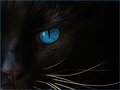
I have been trying to get a black cat on a black background. The theme for this is "Blue Eyes". I can't get more of the left side of the cat into the picture (actually her right side, but left on the image), because she has a white lip with bits of white hair almost reaching the eye. It is distracting and spoils the whole idea.
It wasn't quite what I was after originally, but I am quite happy with this.
The dea for the crop came from this image: //www.jonathanball.co.za/images/stories/JBP_Sunbird/Roger_Pat_de_la_Harpe/9781920289577.jpg
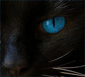
The first image has the most amount of detail. As you crop in more, it starts losing definition in the fur and eye. So, detail-wise, the first image is much better. For me, compositionally, I like the middle crop most.
I agree with the others. The first is quite nice and feels more natural at least to me. The reflection of the window in her eye is less distracting in this view as well since it takes up less of the shot.
thank you all, you are such good "sounding boards".
Here is what I learned: Best to edit a whole picture and then to crop.
Each of these is a new edit, because I "thought" every time I knew exactly what I wanted ... DHUUUU.
OK, the "oldies" here probably read this in disbelief, but perhaps there is one or 2 new people here who may learn from this ... maybe ...
The reason the third one is in at all is because I tried to crop the nose exactly in half. I thought maybe someone would come back and say they liked the half nose better, and perhaps it would work on the left or middle to cut the nose in half.
hanks again ... any more comments of course very welcome :-).
I liked the third one looking at the thumbnails, but upon seeing the full images, the closer crops have crossed the line to where they lose clarity. I'll have to agree with the others that the first one is the best.
The first image has the most amount of detail. As you crop in more, it starts losing definition in the fur and eye. So, detail-wise, the first image is much better. For me, compositionally, I like the middle crop most.
I re-edited the second one and was pleased with it.
It was hard to decide between the first and second. I did like the second crop, but in the end I went with the first one. I liked the way the whiskers went to the right edge, somehow making the image more "complete".
The image did very well at tonight's photoclub meeting - thank you again for all your thoughts, suggestions and time much appreciated.