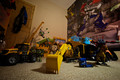
this was a tough shot to get had to have my camera mounted upside down on the tripod to get it low enough stuck i the corner of my lads room, tethered to lightroom as i couldnt see the screen or view find, shoot reposition, shoot, reposition, shoot reposition, move toys. move my son wihtout waking him etc and it bombed....
Personally, your entry was one of my top picks.
#16- snaffles was my top pick;
#10- androgeous and yours were my other top picks.
Out of all your possibles on Flickr, I still like your entry as the "correct" one to go with. Has a story to the pic, and great POV.
The others would have generated a 5 from me... No story, boring.
But I was just 1 out of 115 voters, what do I know...
I wouldn't call it a "bomb" either...
Personally, your entry was one of my top picks.
#16- snaffles was my top pick;
#10- androgeous and yours were my other top picks.
Out of all your possibles on Flickr, I still like your entry as the "correct" one to go with. Has a story to the pic, and great POV.
The others would have generated a 5 from me... No story, boring.
But I was just 1 out of 115 voters, what do I know...
I wouldn't call it a "bomb" either...
i definitely preferred the connection and my boy sleeping in this but i did think the voters would prefer a studio type shot, i aim for 6+ as a rule of thumb so yeah 5.5 is a disappointment
I gave your entry a 6. I probably would have given a much higher score on the first of the other choices. I thought the lighting was much too dark and the composition a little chaotic. I did like the idea however. I really think lighting was my main reason for voting lower.
I gave you a 6 for this shot, i like it, but I find it a bit too confusing, in fact my eyes have turned a little too much to find a subject on which to stop. Maybe with a little more light on the main subject (the excavator).
i definitely preferred the connection and my boy sleeping in this but i did think the voters would prefer a studio type shot, i aim for 6+ as a rule of thumb so yeah 5.5 is a disappointment
Getting high scores for what you like might not be always possible here
I gave you a 5 on this; I think because of the busy-ness of it.
I was just looking at your image when my son walked in, and he said "hey, it's like a game of 'Find The...', you know, like the books where you have to find certain things in a picture. This one's like... 'find the kid', and mum, I found him! He's there!"
I gave it a 4. Didn't like the light, and too many subjects, very confusing indeed (especially the area right of the digger). I think if you only used the crane and the digger, leading the eye to your sons bed, without most of the other toys, you could have scored much better (for me that is).
Ppl connecting on the light can you see the white to black bar along the bottom? I'm using a brand new 27" iMac set to half brightness and spider 3 calibrated and the light on the digger arm looks fine to me. Checked on 17" MacBook bro and iPad.
As for the cluttered I guess as was portraying a true child's room, as my son always has 50 things on the go at anyone time and his room is generally a mine field of toys if you go in in the night.
Challenge description: Photograph a child's toy (or toys) in an interesting and creative way.
I thought your entry hit the mark. The studio/setup type shots, what's interesting or creative about those...???
Different stokes for different folks. I understand your disappointment in the placement though...
Giles, I recognize the frustration of not connecting with the voting crowds in spite of your efforts. My considerations were pretty much the same as the other feedback you got: cluttered, lighting to the right of the digger too dark (or not dark enough, depending on your liking), flat lighting in the rest of the room. Two parts draw my attention and build the picture: the digger and your boy (which I did see). Maybe a tighter crop would've been more to my liking since the cupboard on the left (flat lighting) and the picture on the wall (very busy, but not the subject) do not add much to the overall picture. And then a little more light on the dino perhaps. BTW I gave you a 5. As a final note, going for the studio shots would've been too easy, I think you should stretch yourself like you did.
Maybe because I have 2 young boys myself I got it right away.
Giles to me I got the image in my head of you finding this little guy alseep on the floor amongst his toys and had to scoop him up and put him in bed. The light (to me) looks like the door was left open and something like a hallway light was coming in the room.
Things like that happen in my house all the time but I have to do it twice.
This was one of my top scores I thought you nailed it.
It told a story, it was supposed to be busy, and it was supposed to be dimly lit. I thought you did them all very well.
I didn't vote on yours, since I had given you pre-challenge feedback on it. I think the busy-ness of the scene, the lighting and perhaps a slight color cast is what probably held it back. I think some selective editing to separate the digger from the background could have made it stand out as the main subject.
I try to keep in mind that even a really good shot can only pull a "with the pack" finish on DPC. I've had many of my favorites that have been very well received elsewhere that only do so-so on DPC. (I even have one mediocre finish that I sold for a book cover). My current FS I thought was one of my better efforts, but is only hanging in the mid 5's.
Some of the problem is that we often have a really good image with appeal for a narrow audience. The comments and voting breakdown will usually give you some indication if you nailed that select audience. The commenter's average of 7.66 tells me you did have a good shot that nailed it's target, but it didn't have the visual wow factor to impress a lot of others.
I thought it met the challenge perfectly, and was very creative. I think compositionally it could have been done better. In a complicated image like this, you have compose it like a still life, and think about how to lead the eye through the image. I'm not very good at stuff like this (still learning), so I'm not much help, but I think if you can solve the problem of leading the eye through the image, you could solve the "too busy" and "flat lighting" problems.
This is the best I could find on the internet in short notice.
I thought it met the challenge perfectly, and was very creative. I think compositionally it could have been done better. In a complicated image like this, you have compose it like a still life, and think about how to lead the eye through the image. I'm not very good at stuff like this (still learning), so I'm not much help, but I think if you can solve the problem of leading the eye through the image, you could solve the "too busy" and "flat lighting" problems.
This is the best I could find on the internet in short notice.
I think you missed the point about the composition.
It was staged so it didn't look staged.
I thought it met the challenge perfectly, and was very creative. I think compositionally it could have been done better. ...
I think you missed the point about the composition.
It was staged so it didn't look staged.
No, I got that. I'm just saying that the composition could have been done better. It can be made to look not staged but still lead the viewer's eye through the image better.
personally I think the lack of success can be attributed to the busy-ness of the image.
There is simply too much going on, it does affect the composition as well.
Personally I love the way you can see the sleeping boy's face amongst the toys, it's very clever and adds a lot of meaning to the image.
The lighting and atmosphere of the photo is also very difficult,
It is lit very much like a normal bedroom is lit, and in going for the 'unstaged' look this fits well with your efforts,
but there is something about it that doesn't work aesthetically, it's too plain and seems incandescent.
I think you put too much in the middle of the image. And the optimus prime wall (as awesome as it is) is waaay too visually overwhelming.
yeah the optimus prime wall paper was part of his xmas present unfortunately couldn't cover it up in post for fear of dq
light was just one disney cars lamp think it was 20 second exposure
as for the door, the doors the door cant remove it from the room
I liked the feel of the image a lot...but considering some of the feedback you received...Would it have been possible to orient the camera vertical instead of horizontal and shot from a higher position in a severe downward fashion? This way, your son's head would still be at the top of the scene, the yellow truck would be in the lower section, and the door and poster would have been minimized a bit...
I did think the comp a bit chaotic but also guessed that it was taken in a young boy's room, which usually look like that anyway! Otherwise I really have nothing new to add.