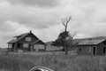
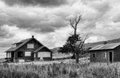
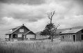
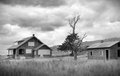
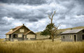
A few days ago I was looking through old photos and this one caught my attention. I took it on a motorcycle ride in Oklahoma and never edited it.
So... here's the progress thus far.
I want to make a print of it, but want it to be perfect first.
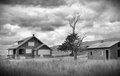
I like it. It's certainly heavy on the tone mapping and glow but i think that can work sometimes to give an otherworldly feel to an image particularly in black and white. I imagine it would look hideous in colour.
I like very much the softness of the original. Sometimes we tend to "improve" too much. Love the clouds in the edited version , perhaps toned even less, but prefer the softness of the cabin and grass of the original.
I'm kind of going for an HDRized look, simply because it's something that'll be in a somewhat "plain" room. So it needs the "pop" factor. If that makes sense.
I suggest you divide the picture into layers - one for the sky, and one for the grass and buildings. I think they want slightly different editing. For me, I like the sky as you've edited it - the increased contrast, the stronger lines - very nice. But, in getting the sky to look right, the detail in the buildings has lost its touch with reality. My gut feeling is that the buildings / grasses want a little gentler touch than the sky - about 1/2 way between original and your edited version. FWIW... ;-p
I like very much the softness of the original. Sometimes we tend to "improve" too much. Love the clouds in the edited version , perhaps toned even less, but prefer the softness of the cabin and grass of the original.
Originally posted by dtremain:
I suggest you divide the picture into layers - one for the sky, and one for the grass and buildings. I think they want slightly different editing. For me, I like the sky as you've edited it - the increased contrast, the stronger lines - very nice. But, in getting the sky to look right, the detail in the buildings has lost its touch with reality. My gut feeling is that the buildings / grasses want a little gentler touch than the sky - about 1/2 way between original and your edited version. FWIW... ;-p
They're quite right, both are very good assessments.
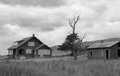
I took a whack at this, let's see what you think. Clearly I could have done a much better job with the original instead of having to just crop down the 800 pixel original from here.
After a quick crop and clone, this was a Topaz re-mask job, took the sky and isolated it from the ground, and created a new layer containing only the sky.
Next, I did a high-radius unsharp mask, something like 70 pixels at 10 percent or so - but this will change depending on image size, so don't pay attention to the actual values, just make the radius big enough that you stop seeing the halo effect.
Then do an unsharp mask or smart sharpen on the ground layer (it's really a full image, but with the cloud layer above it this becomes effectively the "ground" layer). I used a radius of 0.9 at something like 60 percent.
Then I copied the entire image as a merged copy (Ctrl+Shift+C)and created a new layer that I pasted this into.
Next I adjusted the Levels to give me true blacks, and bring the whites up a little, and push the midrange to a little bit of a lighter zone.
Then I did a topaz de-noise on the image, and set it for light denoising. Next I did another run of topaz with low denoise settings, and a high amount of detail recovery.
After that, I ran one more pass of smart sharpen over time image (0.6 px radius 20 percent) just to give it that crisp look.
Remember, ignore the actual numbers and pay attention to the methods, since the numbers will vary.
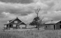
I also did this very quick "dark skies" version for added drama.
If you have any questions, just post here, I'll try to keep an eye on this for a bit.
ETA: Just for fun, I did a very quick dodge brush job on the ground layer before I closed the image, just to add some dynamic light here and give it a bit more life.
--
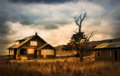
ETA #2 - After looking at your edit again, I saw that you REALLY want the sky to go bang, so here, I pushed it about as far as I could without feeling like it was too much. I expect this is probably more of what you're after... All I did here was just do another run of unsharp mask, high radius, on the cloud layer. Settings depend on what you want, start at 15% strength and a radius of 80 pixels and adjust from there according to your taste.
Lately I have found with editing that once you are working on an image for a while, you can slip down the rabbit hole, tweaking and shifting stuff, version after version. You tend to lose reference for what it was in the original image that made it seem that is was an shot you thought was worth working on in the first place.
When you finish editing pull up your original and try overlaying the edited version and work with opacity layers to fade back and forth between the two; then use brushes to bring up areas you want to accent and submerge of the edited version and the original. I am always shocked how much of the original image is better than the results of all that editing.
Lately I have found with editing that once you are working on an image for a while, you can slip down the rabbit hole, tweaking and shifting stuff, version after version. You tend to lose reference for what it was in the original image that made it seem that is was an shot you thought was worth working on in the first place.
When you finish editing pull up your original and try overlaying the edited version and work with opacity layers to fade back and forth between the two; then use brushes to bring up areas you want to accent and submerge of the edited version and the original. I am always shocked how much of the original image is better than the results of all that editing.
this is actually VERY impressive!
BUT, the trees and grass wouldn't be that green... especially the tree...
its October in Oklahoma... everything's dead! LOL
colorless.
so this edit is way nicer than the actual color photo would have been!!!
ETA: glad you're having so much fun with the image!
you all are really talented!!!