I'm working on a possible logo for a group I ride with. It's called the Night Riders. Well, we ride at night. Duh.
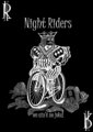
Here's the existing logo that they want to replace:
One of the main uses will be to have it on T-shirts (No jerseys, this isn't a spandex and skinny tires crowd.)
Here's my potential entry in the design contest, so far it is the only entry. I like my general idea. It says "bicycle", it says "Texas", it says "Fort Worth", it says "night riding" and it says "get a headlight".
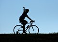
It is based off a photo I shot earlier in the year, where the rider waved at me as he rode past on the hill. I put a cowboy hat in his hand and the skyline of the city in the headlight, taken from other photos of my own.
I think it needs some refinement though. I wanted to work the text into it in some clever way, like having it be the ground the rest of the scene is on top of. Not sure if I may need to put something else in that large empty area on the upper right. I posted it in the group on FB and haven't gotten any feedback other than people "liking" it. But I know this bunch on DPC is far more critical of my efforts.
I wanted to work the text into it in some clever way, like having it be the ground the rest of the scene is on top of. Not sure if I may need to put something else in that large empty area on the upper right.
What about widening/raising the headlight beam and putting the text in there instead of the skyline? Put the skyline below where you have the text. Make the hat bigger -- 15 gallons if need be -- so it's (even) more obvious(ly "Texas"); maybe use some stippling to give it some shading while remaining line art.
Remember that at times it may be printed as small as the DPC thumbnail image.
I also do not like how the grass doesn't line up in the illuminated part and the non-illuminated portion of the image.
That was one of the things I knew needed further editing. I think if I add a few shorter structures in that area instead of the grass, it will look right.
Thanks for the suggestions. I've got a few weeks to refine it yet, but wanted to get some good feedback before I went any further.
What if you were to raise the sky and put the moon in the upper right corner and illuminating the 'Night Riders' with the lighting fading towards the rider.
What if you were to raise the sky and put the moon in the upper right corner and illuminating the 'Night Riders' with the lighting fading towards the rider.
Thanks. I'll try that as an alternate edit and see how it looks.
Disregard the font, it's the idea of the fading light from the moon. I have it from a reliable source (well, maybe reliable) that that font won't work.
Disregard the font, it's the idea of the fading light from the moon. I have it from a reliable source (well, maybe reliable) that that font won't work.
LOL..
Heck you COULD use comic sans, but I might be tempted to throw things out of my car window at you when I see you riding past. ;)
Disregard the font, it's the idea of the fading light from the moon. I have it from a reliable source (well, maybe reliable) that that font won't work.
The idea is a great one btw, looks really good I think - the only trouble is that you'll need to half-tone the gradient to make it compatible with printing processes.
I think the thing sticking up out the back of his neck looks a bit weird, especially as seen in the thumbnail (or distance, if it was on a T-shirt).
His arm?
I know it's his arm, but it still looks weird as part of a logo.For someone who doesn't know, it would just be a "thing". (No reference to the Addams Family intended.)
Creation of artwork from scratch is not a talent of mine. I don't own or have illustrator available, nonetheless know how to use it. A vector image would be better, but I work with what I have.