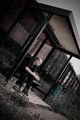
This image made my front page! So it was a success to me.
I know there are some areas of improvement on it, however. So, thoughts? Critiques? Complaints? Anything???
One thing I noticed right after submission of the photo was the glare on the windows. Should have edited that out.
PS: This is the guy that THIS THREAD was created about. :)
got a 6 from me. I like the lighting and the composition is interesting thanks to your tilt. You also dominate the figure with the architecture, which makes it appropriate for the title.
It was a 6 from me. I actually liked the idea, but the tilt seemed too aggressive for a 7 -- it just seemed more of a photographers choice than the wonkiness of life (I know that sounds stupid, but I can't really explain it better. Just because I haven't been able to figure out why some tilts work really well and some seem forced)
I also gave it a 6. I probably would've given it a 7, but like Wendy said, the tilt seemed a little too aggressive. Don't get me wrong, I like a dutch tilt in a lot of instances, but I think it's really easy to overdo it.
I thought the tilt was a little too much... but every time I tried to straighten, it took too much away from the photo. So I stayed with the original framing.
I thought the tilt was a little too much... but every time I tried to straighten, it took too much away from the photo. So I stayed with the original framing.
This is a case where having multiple shots at different focal lengths might have helped -- a wider view might have allowed some rotation without cropping too much.
FWIW I think the shot would have worked just fine shot on the level too, and probably would have gotten you some points deducted by those who couldn't appreciate the intentionally tilted look ...
I have to join the "aggressive tilt" bandwagon, Danielle, although I do also see quite a bit of merit to that choice. I like how the corner of the shelter fits into the corner of the frame. And the exaggerated tilt also gives a sense of danger of him sliding off the bench and out of frame. I'm also not sure about the vignetting in the upper left. Seems a bit too prominent. Finally, there is a vague dimness over the entire image. Mind you, these are all personal preferences. It's a well seen, emotive capture.
At first the tilt seemed a little much, but I read the title and looked again, decided I liked the risk-taking, and that it was worth the 7 I gave it. I do see what Johanna mentions, too, but think that it just added to the overall effect. Very glad you ended up with a new front page image! :-)