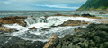
it has none of the pop or color saturation that eye candy shots in a free study require. also there is no real focal point. there is a lot going on but it all seems to jumble together. there is no distance separation between the fore and backgrounds, no appealing sky and the water has no punch to it.
it has none of the pop or color saturation that eye candy shots in a free study require. also there is no real focal point. there is a lot going on but it all seems to jumble together. there is no distance separation between the fore and backgrounds, no appealing sky and the water has no punch to it.
sorry to be blunt but its is just missing a lot, my guess with the lack of comments is that it was hard to figure out why its not appealing, i had to spend a few moments dissecting it for this when in voting i vote have said eh, and moved on.
Since your "subject" is a (fairly) well-known and dynamic feature, I think you might have done better with a tighter crop.
The lighting seems a little odd, like it can't decide between gloomy overcast or partly-sunny. If I were to try re-editing (starting from where it is now) I'd probably try and boost the contrast with an "S"-shaped Curve on the RGB Channel, and maybe try and boost the blue in the sky/sea and the yellows in the land with a separate Curve on the Blue Channel.
You might also try using the "high-radius UnSharp Mask" technique -- I find it helps make a landscape "pop" a little more ... for a DPC entry-sized image try using the UnSharp Mask filter at 15% | 50 px radius | Threshold = 0
I should have known I wouldn't have time to respond to my own thread, school is kicking my butt this term. I really appreciate all your feedback, and will give this photo another edit once I find some time. Thanks again...