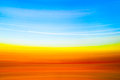
Don't kick yourself -- you made the right choice. The new one is painful, and if you went somewhere between the two, it probably would have scored lower with me. The more subtle colors are much richer, and the reason I liked it was because it was real. When you titled it blue skies and fields of gold, I was there. More saturated makes it cartoon-like and unreal, and wouldn't be nearly as successful, imo.
<--- Bandwagon jumper. Overlay the new edit on a layer over your entry and set opacity to 40-50%, then merge, go back in time about a week and resubmit.
RE: Kicking Myself
That should be in the challenge suggestions forum. :)
Your entry was perfect. I see a lot of meaningless abstracts, but when I've seen yours I thought it was great. You deserved much more but considering the average scores for abstract images you can be happy :)