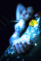
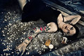
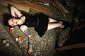
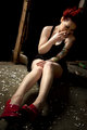
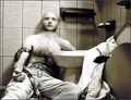
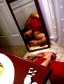
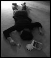
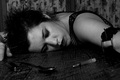
For March's free study, I had a few landscapes that everyone told me to enter, but I really wanted to do something different. I really like photos that tell a story and make you "feel" something.
Piggybacking a little off of Bpzzr's thread going right now about posting things that are a little "different", I'd like to hear peoples' input about entering photos that are "safe" vs ones that might stir up some negative emotions.
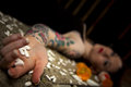
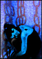
Now I entered "One Last Relapse" and finished in the bottom 20% with several ones twos and threes.
I don't mind hard work and finishing low as long as I grow from the experience. So I'm looking for some feedback so I don't make the same mistakes twice.
Would you say it's the subject matter, the technicals of the shot (focus, lighting, exposure), or processing? Also, do you think one of the others in my portfolio from that "set" be a better choice to enter?
Thanks!
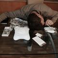
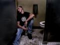
To save time, here are the others from the set.
Thanks again!
I think any of the other would have done better. I didn't vote on this challenge, and do like the picture, but the lighting just feels off or something (not something I can really nail down). After seeing the others, I'm assuming you did it in processing. You might have wanted to tone down the areas that became blown. I don't think they really add anything in this case.
I think the unnecessary editing is the problem. From what I see from your series the images speak very well for themselves without the need for any add ons.
I don't think it is offensive. I think it gets the point across in a very strong way. As far as your score goes, you can count on low scores if you use extreme filters. While they are effective, and some voters will like the result, many voters mark down images that don't look like natural photographs.
As you can see from the score on this image with a similar effect, the score was low, but the image was appreciated by a few of the more artistic minded members.
I recommend that you keep up the attitude you have towards posting photographs that you enjoy. DPC is undoubtedly a land of flowers, water droplets and canadian geese.
I also submitted a photo I KNEW would bomb, but I enjoyed the photo a great deal so I didn't care too much. I am not saying I encourage everyone to submit crap, I mean from what I knew,
the photo I entered was not breathtaking but I personally enjoyed the idea and thought the photo was well executed from a technical standpoint, despite that it ended up in the bottom 8% as I anticipated.
I enjoy the photo you chose out of the outtakes from the set simply because the face is out of the DOF. It bothers me a bit when the model is casually looking at the camera with an expression saying "hey, sup"
for a photo like this, if she was peering slightly off to the left or right it would be a lot more interesting. I have a mixed opinion about the blue hued PP you chose, I enjoy the neutral tones of the original photos but the blue is very ravey.
The only suggestion I have regarding subject matter, is this:
It seems to me from you stating that you wanted to create a photo that tells a story and allows you to 'feel' that there was a far greater desire to create a photo that was exceptional from a fine art standpoint rather than
a photographically exceptional standpoint.
This subject matter has simply been done to death (careful pun territory haha) From attending fine art school and working with developing young artists for the past few years I have noticed that
whenever an artist wants to create something "shocking" or "super emotion filled" it falls into the categories of : race/racism, gender, drugs, family, abuse, etc. These issues are definitely important to address but
if they are going to be addressed I recommend that it is done with some prior research.
if you go on a website like deviant art and do a quick search for "drugs, drug overdose, photography" you will find hundreds of images that look almost exactly as yours does whether they are executed more poorly or more exceptionally than your own image. This is why when I saw your image in the challenge I thought "oh this again" rather than getting offended and the way my vote fell was definitely affected by that first reaction I had.
In summary,
I don't think you made any mistakes at all. I immediately encourage yourself and everyone to push themselves to create a photograph that is unique and different in a way that they find it important to them as these are the kind of photos that will generally have a greater impact on those viewing them.
Most of us know what will make a good photo on DPC and when I first joined that was my attitude, being that I recently re-enlisted for the first time in years and being somewhat embarrassed by almost everything I have entered to this point I am trying to do my best to heed my own advice here.
Sometimes you have to give less of a shit about what people might think or be worried about, if that's your only concern you'll never really enjoy yourself.
That is a very well-done (if not particularly original) image. Choosing to use extreme editing is always iffy on DPC. Sometimes it rocks the house, other times it's stoned to death. For me, there are two things that don't work. The first is the blue tone you chose. I just think it's too bright and cheerful. Something much more gray and far less saturated would have sent the message of death much better. The other is the tilt. Your 4444 outtake is much better in terms of "decay" "death" etc. The entry is almost too vertical, as though she is reclining rather than dead. These are personal preferences, however, and should be taken as such.
Of far more importance is your approach to DPC, and I give you a standing "o", because by embracing that philosophy is how you will go FAR on this site, rather than choosing which way to edit something.
I like the series you did. I particularly like the one with the gal smoking. Something that bugs me about the pictures is the sheer number of pills lying about the model. Too many and so scattered that it's not random anymore. Plus they look like tylenol. However, I don't think that's why the image didn't do well in the free study. Unfortunately DPC is particular and these types of images don't really fit in.
Thank you so much everyone for your feedback. It's exactly what I was looking for!
In regards to the choices made in processing, I was going for "pharmacy lighting" lol You know, the fluorescent blue-ish, stale, lifeless feel. Something you might see from the movie "One Hour Photo" :)
slickchik- Ur right it was tylenol! But had it actually been lortabs you wouldn't be able to tell the difference, they are identical. I agree with the "too spread out" pills also.
Sebi- I sincerely appreciate your well thought out comments. My only feedback for your feedback is don't presume to know what research someone has or has not done. For example if my mom had died from a lortab overdose and I spend all my time learning about and dealing with addiction, that could have been a pretty offensive statement in itself.
Also I'd never compromise on something I strongly believe in, but I hope the day I "don't give a shit what anyone thinks" never comes. I hope I'm never too proud to take constructive feedback.
Thanks again everyone, all your feedback has helped a ton!
I apologize for any offence my comment may have caused, as far as research was concerned I only meant looking at other works containing such imagery from a purely aesthetic/technical standpoint.
I assumed the theme of the photo was something close to you and should have chosen my words more carefully. As for the rest, my phrasing might have been a bit extreme, I meant "not give a shit" more along the lines of
"trusting your gut" rather than ignoring criticism.
offensive? no. i just didn't find it particularly interesting, to me it is missing some sort or gritty or grungy feel. drug overdoses aren't supposed to be pretty and this photo is.
I prefer this shot from the set. I like it better than your entry because of the view point. In your entry, the view point you shot from leads me to look more into the blurred face than into the focused hand. In the shot above, the view point and the blurred area both lead me to the hand in focus allowing me to rest on it even though I can view the whole scene. I also wasn't too fond of the processing in your shot. The blue color didn't seem to hit that flourescent lighting you were going for and the lighting was fairly bright in spots.
Your PP and exposure probably did hurt your score. Of your series, for me, #4444 has the strongest impact, especially with the focus on the pills, the composition and the model not staring into the camera. It (#4444) probably would have scored very well in a different challenge like "Addiction" or "Dead End".
I don't think it's offensive.
The problem for me is the pretty model with perfect make-up, gazing into the camera. Not gritty enough for the subject matter. I prefer 4460, it's more raw.
IM(NSH)O, short version - it did not communicate your message clearly and unambiguously to the viewers. Rather than grabbing the viewer in a choke hold around the neck, its nebulousness allowed the viewer to linger, finding criticism after criticism, and ending up not liking the picture.
There are a couple of things that don't work in the shot. #1 is the position of the far arm - if a person is unconscious, an arm does not stay in an upright position like that - same thing with her upcurved fingers. As others have said, this looks like a reclining shot, not a flat on the floor shot. For me, there is nothing in focus in the shot. Not sure I object to the bright colors, but the oversaturated white pills are focal points that draw the eye, rather than allowing it to take in the whole scene. Also, pill bottle should be "down" and "away" from the hand, not above it and between the body and hand.
A well-done convincing drug overdose shot may very well be offensive and troubling, but that is the intent, yes?
I would have scored this higher had the editing been like the rest in the set.,. which are all very good i might add, i like the shoot overall.. yes for me its the weird edit that kills the image.
In short, no. Not offensive at all. I don't think I've come across any images on DPC that are offensive. Others have said it, I think the PP is put you in the bottom 20 percent. I understand the 'pharmacy' look you were going for only AFTER you mentioned it here. Keep entering what you feel is good and don't worry about the 'popular' vote.
To me, the somewhat pristine nature of the shot is what kills it. The angle is too flat and too skewed, the girl's flawless nails are far too prominent in the image. Especially as I've actually worked with homeless people and hardcore drug addicts, I'm a very hard sell when someone enters a shot of someone who isn't one, and tries to pass them off as such.
To me, the somewhat pristine nature of the shot is what kills it. The angle is too flat and too skewed, the girl's flawless nails are far too prominent in the image. Especially as I've actually worked with homeless people and hardcore drug addicts, I'm a very hard sell when someone enters a shot of someone who isn't one, and tries to pass them off as such.
Yes. A sort of soviet realism cum fashion show highlighting the faux details.
Julianne's photo is the gallant exception.