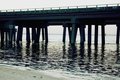
Hey everyone. I recently updated my portfolio to include some photos from a trip to Destin, FL that my family and I took back in 2010. I was wondering if anyone wanted to critique these...
I would like to go back this summer with the family, so perhaps some insight as to how to make them even better would be great.
For me, the bridge is unremarkable in it's own right - there's nothing about the image, as is, that is drawing me to it. That could be in part due to the grey-ish nature of the background and my mood at the moment, the exact same qualities may work for other people (that's the beauty and drawback of "art").
The second image has too much "sky" and not enough "focus" in addition to the sand and water feeling washed out. If you were aiming for footprints on the beach being the focus, change the aperature to keep the focus up front on the sand and partly the water, while the horizon and sky should be more out of focus. Aside from that it just looks like a picture of a beach on a nice day. Cropping out some of the superfluous clouds/sky could help to keep the image more focused on the sand and water.
The third image is the best of the three in my opinion. You have a good blend between land, sea and air, the only problem i have with the image is the seemingly dark spots - i'm not sure if you ran this through some filters for colour/brightness/etc, but the horizon seems very black, the right side of the image has a dark area of the water and the sky seems to get darker the closer it gets to the right side of the image. This, to me is compounded and with a dark spot in the bottom left from the wave gives an 'off-balance' feel to the image.
Overall i think they're all decent images technically without any huge flaws, but there's not really anything drawing me into them.