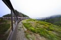
So, I learned about dodge and burn the other day. Three years I've been doing this, and I'm just now learning how those two features of PS work. Amazing.
Here's an old shot from my trip (aka honeymoon) to Alaska that was good originally, but was (I think) vastly improved by a little dodge/burn.
Thanks ,really need to compare what you had before.
Okay, sure.
I was just looking for comments on the shot in general, not necessarily the editing (but I'm interested in that also.) However, I can see in how I made the OP that it wasn't clear what I was looking for critique on. Thanks.
Well you have certainly improved the shot. There is a lot of empty space but its a fair shot.If this where in a free study challenge I would be giving it a 5 ish.
Perhaps others will be along soon with more words than I to comment on your image.
ETA: I just noticed the full-size version you gave us is a different exposure/frame from the first one :-)
I really like this...I think it gives a more realistic impression of the feeling on that train than my processing. I'll take these notes and put them to good use, thank you very much!
Also, I could've sworn it was the same image, but I guess I messed up. I was just trying to pop something up here quickly without reworking it much and basically see what folks thought. However, now that I try to find the original image, I have no idea what I've done with, and that is surprising as I keep a pretty organized digital portfolio. :/
FWIW, I prefer the composition of this second iteration to that of the first one. In the first one, the near window is too dominant; I think this is a better balanced shot by quite a bit.
FWIW, I prefer the composition of this second iteration to that of the first one. In the first one, the near window is too dominant; I think this is a better balanced shot by quite a bit.
Thanks. I'm trying out some work in Viveza similar to what you've done, but I don't know a great deal about processing...mostly just piecemeal stuff over time. I came up with this using Viveza alone, and wasn't sure about how you did the "sky gradient" you mentioned. Forgive my idiocy on PS matters...
1. Cntrl-shift-N to make a new layer.
2. In the dialogue box name it "gradient", select "multiply" from the layer mode drop-down arrow, and tick the mark for "Fill with multiply-neutral gradient (white)"
3. Make your toolbox color picker tool the default, with black in foreground.
4. Select the gradient tool in the toolbox.
5. In the toolbar at the top, hit the dropdown arrow and choose the "foreground to transparent" gradient.
6. Be sure the "gradient" layer is the active layer and draw straight down witht he gradient tool from the top edge of the picture to about where the trestle is.
7. Now in the layers palette, fade the opacity of the "gradient" layer until you have the amount of darkening youw ant.
****************
That's the basic model. You can draw the gradient with a blue color and get some blue in the gradient, if you want. Or any color at all for that matter :-)