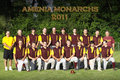
I'm editing a basic group shot for a local baseball team. I don't know what is expected for the editing. Is this too over-the-top, or is this what's expected? Is it over-the-top either way?
It looks okay to me. Text is nice. Top gradient a little overcooked, bottom gradient is fine. The faces seem slightly overexposed to me in this processing, I'd like to see that muted a little, but in the end it's about how it prints, not how it looks on my screen...
The faces do seem a little bright. The only way to have prevented this would have been to get the sun at their back and use a flash in the front so you could control the light. All in all...a good team shot. I'd put out a few buck for it if I was on the team !
It looks okay to me. Text is nice. Top gradient a little overcooked, bottom gradient is fine. The faces seem slightly overexposed to me in this processing, I'd like to see that muted a little, but in the end it's about how it prints, not how it looks on my screen...
R.
I agree, and on my monitor the yellow in the clothing is pretty intense. A bit less gradient at the top, and a test print to see how the faces and the yellow really come out is probably worth a try.
In group shots I have found that if you aren't in the picture, it is about the over all feel, which here looks fine. If you are in the picture, it is about how you look in the image, which here is only okay, the faces are over contrasted and a tad blown.
I left some comments, but forgot to add that I would have changed their team name. "Mothras" maybe. Something a little more, um... well, less like butterflies. Just sayin. ;-)