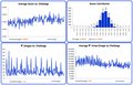
I think the interest is waning in the voting stats threads. I know that a little bit of stats can go a long way and it’s time for a break. I’m skipping the 9th post and going straight to the last which is the 2011 YTD post. If you want to read about the “Inversion Voter” you can catch it at this link: Link
Just so you know, my interest hasn't waned. I always enjoy reading your posts, and always look through the tables/graphs you have posted.
I think this sort of thing is really cool, and really appreciate the work you put into it
How cool. All the stats I've been curious about linked for me in one thread. You are wonderful!!
I can't believe all the work you've put into this. Thanks!! Looking forward to more...after your break, of course. ;)
As always, a great job - and thank you for providing much food for thought and discussion!
I'd be curious to compare the average score per challenge graph and the score distribution graph with the same from the past 5 years to see if there is any validity to the comments that many seem to be making about the overall average voting going down in the recent years.
You’ll see that I converted the original charts from monthly to “by challenge” format last week. They actually show that averages were at their lowest before 2006. They've been pretty stable and near the mid-point since 2006.