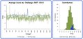
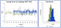
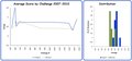
Introduction: Below you'll find a few more comparisons of averages based on challenge types and challenge rules. The data represented is from 2007 through 2010 only No commentary from me in this section just some charts for your review.
Free Study Challenges vs. Not Free Study Challenges
Exclusive Open Challenges vs. Member Challenges
Basic Editing vs. Advanced Editing
Expert Editing vs. Minimal Editing There really isn’t enough data to plot this group in this style but here are the charts anyway
Hmm...interesting comparisons, and the trends make sense.
Couple questions because there is something 'odd' about the data, that I can't put my finger on.
Is the score distribution plot generated from the all the individual scores per category? Given the N for free studies, that would seem to be the case.
Then, how is the average score by month calculated?
Can you post the descriptive statistics for the score distribution plots? Better yet, can you post the score distribution plots with a greater bin?
Interesting plots with clear difference. I suppose that's expeected.
Any data on speed challenges? I know they're infrequent but might be interesting to see how the average is under time-pressure.
Is the score distribution plot generated from the all the individual scores per category? Given the N for free studies, that would seem to be the case.
Yes the distributions are calculated from the individual scores. The averages are per month as erlier plots have been illustrated for consistency.
That's what I thought. Can you post the distribution plots with thinner buckets? Perhaps 0.1 or 0.05 would do.
Originally posted by DJWoodward:
Originally posted by PGerst:
Is the score distribution plot generated from the all the individual scores per category? Given the N for free studies, that would seem to be the case.
Yes the distributions are calculated from the individual scores. The averages are per month as erlier plots have been illustrated for consistency.