Simple question, with a not so simple answer I imagine.
Whether I'm reading books, online websites, forums etc, the "prevailing thought" is that a tighter crop is better. To focus the eye on the focal point of the image, to remove distractions, to stop the eye wandering etc. Quite often, negative space around your image is, well, negative. Not a good thing.
However, I happen to like negative space. I feel it does a great job of providing context to your focal point, putting it in perspective so that it's not just an isolated subject/object.
So my question is, when is negative space a good thing, and when is it a bad thing? On what kind or genre of images is negative space a beneficial compositional tool?
Well, i guess one way that negative space works well is to give a sense of potential movement.
I don't think this... would work as well without the sense of movement and freedom the negative space gives. If it were cropped tighter it would be a very different static image.
It's very much a compositional thing that can work for you if used right. Sometimes you end up with negative space that does not work, however. Such was the case with my recent freestudy entry.
The big black area on the upper right does not do anything for the composition, but it didn't look right to me cropped in closer. Fortunately the rest of the image was strong enough to overcome this and I only received one comment regarding my choice of composition.
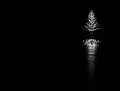
A fair amount of negative space that adds a breathing space or a final destination of movement should work well. For my Out Of Balance entry, I decided to overdo it, and it obviously did not work out well.
It's very much a compositional thing that can work for you if used right. Sometimes you end up with negative space that does not work, however. Such was the case with my recent freestudy entry.
The big black area on the upper right does not do anything for the composition, but it didn't look right to me cropped in closer. Fortunately the rest of the image was strong enough to overcome this and I only received one comment regarding my choice of composition.
Actually, on this one I disagree: the empty, black space is a major emotional element in the image for me. It kind of alludes to a vast emptiness of time & space behind the aviator; it seems entirely appropriate to me. And it's a "rich" black too; that's important. It's hard for me to imagine liking this image more of that space were filled with anything, though I suppose if there was a *hint* of detail in the darkness that would work also.
An interesting question. I also like negative space.
Seems I use it in a fair number of my images! I think it works best when it "implies" something, like scale or movement. I also like when we can "see" the rest of the subject in it (such as my example above) even if there is not actually something to see. For tiny subjects in enormous negative space, the subject must be incredibly compelling and interesting to support all the space.
Some interesting responses and comments regarding my FS shot. Thanks. Just goes to show that one can never really know how something will be perceived by others, and trying to predict the mass appeal of your photos is a pointless exercise.