Thanks to bassbone and giantmike for the comments on all the photos. For those of us who are necomers and wanting to learn, they are invaluable tools.
Taking the comments to mind, I revisited my photo from the June Free Study - Does this make a marked improvement? Any ideas or suggestions welcome! - I'm still learning PSE so I know there's far more I could do, but haven't figured out yet.
Entry: Revisit:
If anyone wants the original CR2 Raw file, drop me a line and I can email it to you.
comparing the 2, i think i would've scored both at about the same level. the 2nd one does look a bit cleaner with tighter crop but there is just too much negative space and the subject doesn't really have impact for me. the lighting and exposure looked good but nothing grabbed my interest.
Thank you - I've probably been reading too much... I was actually aiming for the negative space, but probably should've found a subject that popped out more - or maybe did a different take with editing the front leaf into red...
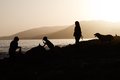
Well I decided to revisit my dud. Here's the entry:
Based on comments, I cropped it to be simpler, and added color to the sky, which is probably a no-no per DPC rules since there wasn't any color there in the original. Also lightened the foreground.
I don't think that worked. I think my best bet was not to enter. :-)
I had given your original a 7 - I probably would have gone down a step with the re-edit... While the color is beautifully done, it splashes too much over the person on the right and doesn't look like a natural lens flare. I really thought the dog made the picture - perhaps cropping it just between the dog an the farthest right person... course yours did better than mine, so who am I to say... Ha!
There's nothing wrong with doing color shifts, Deb. Look at it this way; since you can make something that IS color B/W, how can they keep us from making something that is NOT color, colored? The only restriction is that you not create new shapes or features when so doing. Can't add a rainbow to a gray sky :-)
I thought the original was wonderful, gave it an 8 and fav'd it during the challenge. Now, I know that I don't have lousy taste, so it must mean that other people do!
Well I decided to revisit my dud. Here's the entry:
Based on comments, I cropped it to be simpler, and added color to the sky, which is probably a no-no per DPC rules since there wasn't any color there in the original. Also lightened the foreground.
I don't think that worked. I think my best bet was not to enter. :-)
Another attempt based on additional feedback regarding HDR to bring out the foreground. Used Topaz, but sorta the same thing. Also cropped to a different aspect ratio. I may like this one better other than the noise from the processing. I actually quite like it (noise and all) in B&W.