| Author | Thread |
|
|
06/01/2010 08:47:52 PM · #1 |
Hello all,
I entered this shot for the missed focus challenge: 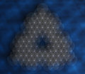
Clearly, not a perfect shot, but - I was surprised - many of you thought it was pretty plain - as indicated by a very high number of 4/5 votes.
So, I'm just throwing it out here for a bit more input - what did you like or dislike here? Any ideas as to how I could have scored better with this technique?
(On the technique -- shiny ball arranged on a piece of paper with variegated markings.-- Nothing fancy really)..
-Cheers- |
|
|
|
06/01/2010 09:01:22 PM · #2 |
I gave it a 7, i thought it would have scored higher than you received.
It looks like you put a bit of thought into your shot unlike some of the other missed focused entries that did better than you. |
|
|
|
06/01/2010 09:06:17 PM · #3 |
I have to admit that I didnt/dont get it. Still not sure what the image is of. and that is why I didnt score you very high.
|
|
|
|
06/01/2010 09:18:13 PM · #4 |
I scored it a 5....my avg score. 3s and 4s are for really bad shots.
I think I gave 6s and 7s to the shots that showed "missed focus". For example, a baseball player smacking the ball is out of focus b/c the top of the fence caught the autofocus and ruined the shot.
I know the description was exactly the opposite of what the title "missed focus" seemed to mean, however, I had to vote on my take of the challenge.
Your shot in question seems like an out of focus picture...nothing to convey "missed focus"....again that is just MY take on the challenge. |
|
|
|
06/01/2010 09:22:12 PM · #5 |
I have to agree Ken. I had the same scale... well pretty close... but because i didnt even get what this was this one actually got a 4 from me. Im sorry
|
|
|
|
06/01/2010 09:22:50 PM · #6 |
Originally posted by kenskid:
I scored it a 5....my avg score. 3s and 4s are for really bad shots.
I think I gave 6s and 7s to the shots that showed "missed focus". For example, a baseball player smacking the ball is out of focus b/c the top of the fence caught the autofocus and ruined the shot.
I know the description was exactly the opposite of what the title "missed focus" seemed to mean, however, I had to vote on my take of the challenge.
Your shot in question seems like an out of focus picture...nothing to convey "missed focus"....again that is just MY take on the challenge. |
Oh it was, no doubt, very intentional.. And I did account for the fact that some people would go by title rather than description.. :)
Still, thanks for the vote! And a double thanks for the comment. |
|
|
|
06/01/2010 09:23:26 PM · #7 |
Originally posted by DaveMac:
I gave it a 7, i thought it would have scored higher than you received.
It looks like you put a bit of thought into your shot unlike some of the other missed focused entries that did better than you. |
I think that might be part of the reason it scored where it did... There was obvious thought put into it.. |
|
|
|
06/01/2010 09:24:37 PM · #8 |
Originally posted by JustCaree:
I have to agree Ken. I had the same scale... well pretty close... but because i didnt even get what this was this one actually got a 4 from me. Im sorry |
No sorry, you simply didn't like it... That's totally your right... And what's more- Thanks! Both for the low vote (If you didn't like it, I deserved that 4..), and thanks even more for the comments! Those are worth more than a 10 any day for me... |
|
|
|
06/01/2010 09:33:10 PM · #9 |
Originally posted by coryboehne:
Originally posted by JustCaree:
I have to agree Ken. I had the same scale... well pretty close... but because i didnt even get what this was this one actually got a 4 from me. Im sorry |
No sorry, you simply didn't like it... That's totally your right... And what's more- Thanks! Both for the low vote (If you didn't like it, I deserved that 4..), and thanks even more for the comments! Those are worth more than a 10 any day for me... |
well Im sorry because I didnt comment... my comment percentage is usually about 20% I try to comment anything I vote below a 5 and all my 10's I think I was having a rough night when I voted...
Its not that I didnt like it btw.. it is cool... I just didnt know what it was. LOL still dont... i wish i could see an infocus shot so I could see.
|
|
|
|
06/01/2010 11:07:02 PM · #10 |
|
I didn't vote on this challenge, but a spelling mistake in the photo title is never a good start. Spelling nazis like myself may try to ignore it, but if I'm tossing between a 4 and a 5, then it's gonna push me closer to the 4 button. |
|
|
|
06/01/2010 11:17:11 PM · #11 |
LOL...and I didn't even notice the spelling error !
Originally posted by Lonni:
I didn't vote on this challenge, but a spelling mistake in the photo title is never a good start. Spelling nazis like myself may try to ignore it, but if I'm tossing between a 4 and a 5, then it's gonna push me closer to the 4 button. |
|
|
|
|
06/01/2010 11:38:24 PM · #12 |
|
It looks to me like some sort of special effect filter was used, rather than missed focus. I didn't vote, but perhaps others had the same thought. BTW, I do like the effect and the image. |
|
|
|
06/01/2010 11:59:12 PM · #13 |
Originally posted by Lonni:
I didn't vote on this challenge, but a spelling mistake in the photo title is never a good start. Spelling nazis like myself may try to ignore it, but if I'm tossing between a 4 and a 5, then it's gonna push me closer to the 4 button. |
What's odd is I would swear I checked it using the comments area that does show spelling errors... *Shrug* Being a bit of a spelling nazi myself, I thought something looked odd, but just trusted the computer.
Totally embarrassing.. But kinda funny really... Ok, so now I see that it scored far too well.. Far, far too well. |
|
|
|
06/01/2010 11:59:21 PM · #14 |
|
I gave it a 7, but I like abstract photography, and this is about as abstract as you can get. I do think the brightness and colors could have used a little cranking up, especially the grayish-whites. |
|
Theme:
Classic /
Light /
Dark
Home -
Challenges -
Community -
League -
Photos -
Cameras -
Lenses -
Learn -
Help -
Terms of Use -
Privacy -
Top ^
DPChallenge, and website content and design, Copyright © 2001-2026 Challenging Technologies, LLC.
All digital photo copyrights belong to the photographers and may not be used without permission.
Current Server Time: 09/25/2026 06:41:17 AM EDT.




