I notice that B&W seems to be very popular for this style re the previous challenge results.
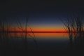
From my portfolio, this one is the one that I would pick for this challenge. I like B&W but I love color.
See to me, I wouldn't consider that low key, but I am probably in the majority, as it is a beautiful shot.
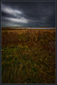
Not very interesting, but would this be accepted as an example of Low Key or is there too much light??
(from my profile as an example...not an entry folks!)
I wouldn't... It's borderline, anyway, for me. On the other hand, I'd be inclined to define this one of mine as a low key landscape, so maybe I'm inconsistent?
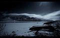
I wouldn't slam the pelican or anything, it just doesn't seem to shout "low key" for me.
I wouldn't... It's borderline, anyway, for me. On the other hand, I'd be inclined to define this one of mine as a low key landscape, so maybe I'm inconsistent?
I wouldn't slam the pelican or anything, it just doesn't seem to shout "low key" for me.
R.
Uh-oh. This is going to get interesting. I thought Low Key would be fairly straight-forward (definition thereof), but it seems not.
I am curious if my single light source photos would be considered low key:
Would something like these be too light?
Or something like this too dark?
As far as defining "low key", you basically can't BE too dark. All black is as low-key as they come. The first two just look like normal lighting/exposure to me. The third one is definitely low key in my book.
As far as defining "low key", you basically can't BE too dark. All black is as low-key as they come. The first two just look like normal lighting/exposure to me. The third one is definitely low key in my book.
R.
Thanks Robert. That helps point me in the right direction!
low-key is my favorite genre in studio portraiture. I think it is important to have some bright highlights in the frame but they should occupy as little space as possible :). some examples
but I think I will have to miss this challenge... :(
LevT, what was the light positions on those shots?
for the first, it is backlighting: single vertical striplight to the right and slightly behind the model
for the second, I don't remember exactly :), i think some combination of a softbox and a reflector, with dark background
I wouldn't... It's borderline, anyway, for me. On the other hand, I'd be inclined to define this one of mine as a low key landscape, so maybe I'm inconsistent?
I wouldn't slam the pelican or anything, it just doesn't seem to shout "low key" for me.
R.
Does it matter whether its low key, look at the winners of low key I and II, pretty much all the top 10 are B&W or danging well near.
Well your picture is low key by definition I've read "few highlights" and I rather like it (though to be honest the sky looks a bit disconnected) but look at pictures on google and well they're all black and white with some pretty dogarn prominent highlights if you want my opinion.
For what it's worth - my daughter says: In our arts classes they said - as long as the histogram is mostly on the very left, it's low key.
That's actually a very good way of describing low-key, technically. However, voting results on past low key challenges suggest a distinct bias towards dramatically-lit, single-light-source images, mostly b/w. There's a particular subset of low-key called "film noir" that is characterized, aesthetically, by b/w filming and contrasty, moody, often low-key lighting (film noir is also defined by the bleakness of its subject matter and attitude, but that's another story), and this sort of aesthetic seems to be what the voters tend to think of when they are judging "low-key".
Still, Heida won a blue with this one, so the above is not an absolute:
But, basically, if you look at your histogram and most of it is piled up well left of center, with maybe just a few spikes over on the light side, then you've pretty much, by definition, got "low-key". For whatever that's worth... I wouldn't consider images where the subject is entirely in the mid-tones to be low-key, myself. Down-key maybe, but not low-key.
I think the shifted histogram makes the most sense to me. Bear makes a good point about too much mid-tones. Good discussion, helped with my lighting and processing.
Through some trial and error with a shot I've been working on, I've learned it very much matters what your computer's display settings are when editing and viewing low-key photos. What I thought was a low-key shot on my machine, when viewed on another machine, was very much *not* low-key (or at least not *as* low-key as I wanted).
So, when people start (basic) editing and voting, I sure hope their displays are calibrated correctly.
For what it's worth, I'm on a MacBook and my display's color profile is (now) set to sRGB IEC61966-2.1.
However, voting results on past low key challenges suggest a distinct bias towards dramatically-lit, single-light-source images, mostly b/w.
R.
Geez, I'm teetering between my usual B&W, one that I think is cool but has a few DPC borderline "no no's" to a color image that I think is may be far better BUT in color and that might not fly with the noir leanings of some.
I am in and I am very pleased. I was able to execute my vision for the shot almost down to a T. I think it should score well - which means I have a mid 5 coming to me.