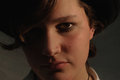
Can someone take a look at my picture and tell me why it got such a bad score? at 4.3 or something I really liked this photo but from the looks of the comments I was the only one who really did like it. So yeah tell me what you think please!
Personally, I did not see the month of May in this photograph. The composition works well enough, I don't think that the background is too busy (unless of course this was strictly a portrait), but I mean, when the background calls as much attention to itself as this one does, you have to ask yourself, "what does the background say about the rest of the image?" The lighting is good, the details are well preserved, but this image does not stand out to me as anything other than a relatively straight forward portrait. Just my opinion...
I also did not see the month of May as your chosen month. Also, her skin (on my monitor) is yellow . There needs to be more space above her head, it feels squished and I wish the background was blurred out with a more pleasing dof. A minor but distracting part for me was that the whole image is dipping on the right. She is a pretty girl that is for sure - what is going on with her front teeth on the lower part. I also think if there were catchlights in her eyes that would have helped keep them from looking so flat. I hope this helps and doesn't hurt your feelings - this is of course my opinion and certainly I am sure others would disagree but that was my interpretation.
No doesn't hurt my feelings that's why I asked. I just wasn't happy with the feedback i got from before. no one ever gives a good reason to me and its frustrating when they dont cause I never know what to fix to do better.
Is this any better for the eye "pop" lol. I made it a little more focused.
It didn't come up for me in voting. I think I would have most likely given it a 5. Possibly a 4.
There's a heavy yellow cast on the image. It was probably shot late in the day, but for a portrait, I think adjusting to a cooler white balance may have helped give it more natural skin tones.
There is an awful lot of compression going on here as well. It's not obvious, but is surely taking away some detail and clarity. Your file size of only 61k indicates a highly compressed image and that may be robbing some detail from this image. Check your compression settings when you save your file. Always adjust JPEG compression so that your file size is as large as possible, but within the challenge limit. (200k for this one)
One other thing I noticed is some minor but noticeable acne on her cheek. Easily cloned out within advanced rules.
Added: I had a look at the comments you have left, and you have left a good mix of comments on photos you like and critiques explaining your vote on the ones you didn't. Being a person who comments on the mid pack shots is a good step toward encouraging others to do the same. As you are well aware, the people scoring in the 4's and 5's really appreciate getting the feedback. (Most of us, anyway!)
It didn't come up for me in voting. I think I would have most likley given it a 5. Possibly a 4.
There's a heavy yellow cast on the image. It was probably shot late in the day, but for a portrait, I think adjusting to a cooler white balance may have helped give it more natural skin tones.
There is an awful lot of compression going on here as well. It's not obvious, but is surely taking away some detail and clarity. Your file size of only 61k indicates a highly compressed image and that may be robbing some detail from this image. Check your compression settings when you save your file. Always adjust JPEG compression so that your file size is as large as possible, but within the challenge limit. (200k for this one)
One other thing I noticed is some minor but noticeable acne on her cheek. Easily cloned out within advanced rules.
I always forget that I am aloud to use the clone tool for minor things like that. (otherwise I probably would have used it) i like the clone tool :)
PaintShop Pro has a blemish fixer that makes it easy, easy, easy. It simply blends a spot with the surrounding tones. I've also used it to help selectively smooth out noise grain in skies. I don't know what you are editing with, but if you use Photoshop or elements, I would expect it to have a similar tool.
PaintShop Pro has a blemish fixer that makes it easy, easy, easy. It simply blends a spot with the surrounding tones. I've also used it to help selectively smooth out noise grain in skies. I don't know what you are editing with, but if you use Photoshop or elements, I would expect it to have a similar tool.
Im using Photoshop CS2 and it has the clone tool and the ummm crap... *opens photoshop* the spot healing brush which is VERY easy to use to get rid of blemishes. :)
Here. Did this really quick but I toned down the yellow considerably and cloned out blemishes, sharpened the eyes and used a smart sharpen filter to remove the motion blur.
After that I'd try to bring out the warmer tones in her skin, but it's late...
Not to take any attention away from the OP, but I was also wondering about my own score for the Calendar challenge - I know that the content of the photo doesn't exactly relate to the month (at least in a way that you wouldn't have to research a bit to figure out), and that the photo itself is a bit dark. Can anyone give me some constructive criticism, so I know what to work on?
when a person thinks of a calender , they usually think landscapes, cute puppies, kittens, cars, motorbikes and nude women (or in my case naked firemen hehehe).
I think you may have been deducted a point or two for that with out even realizing. They don't scream calender
when a person thinks of a calender , they usually think landscapes, cute puppies, kittens, cars, motorbikes and nude women (or in my case naked firemen hehehe).
I think you may have been deducted a point or two for that with out even realizing. They don't scream calender
Dammit Juliet - I just went to your portfolio looking for the naked fireman entry....
To me both of these shots lack any kind of real interesting features and appear more like snap shots and would not likely appeal to the masses as far as something they would buy in a calendar. I agree with the earlier comments as far as the first one having a very yellow cast and the second being to dark, neither of the images appear to have started out with good lighting and or exposures which makes it more difficult to process and get their features to come alive. If I would have judged these two images they likely would have both been given 3-4 by me mainly because they did not create that wow factor and the exposures and colors were not very well done along with the fact that if I did not know these people personally there is no other subject matter in the shot that would make me want to buy the calendar. Hope the info makes sense and helps.
Just for the sake of illustration, here's a quick 'n dirty remake: the selection's a little iffy, but the image size is too small to make it worth struggling with.
1. model selected, copied, and pasted as a new layer over the base layer
2. base layer duplicated and blurred with gaussian blur
3. "match color", "neutralize" used on base layer
4. "match color". "neutralize" used on overlay layer, with added luminosity and fading the neutralization to keep some color
5. overlay layer duplicated and healing brush used on blemishes
6. new overlay layer filled with gray created and white paintbrush used to dodge eyes and teeth.
The key thing here, of course, is to realize just how negative the busy BG is by seeing how well she stands out when it is blurred.
The key thing here, of course, is to realize just how negative the busy BG is by seeing how well she stands out when it is blurred.
R.
Well, personally, I like the way you handled the subject. But I feel that the gaussian blur is a little much (maybe a lens blur filter would look better?) But I think you're point about the bg remains valid.
The key thing here, of course, is to realize just how negative the busy BG is by seeing how well she stands out when it is blurred.
R.
Well, personally, I like the way you handled the subject. But I feel that the gaussian blur is a little much (maybe a lens blur filter would look better?) But I think you're point about the bg remains valid.
Oh. I agree, the idea was just to show how MUCH the BG distracts by basically eliminating it... Some less-extreme treatment would work better.