I may reopen it. I can still visit the galleries though.
Well, I'm sure your fans will appreciate and respect your portfolio here and at 1x. Also, if you re-open your account, I would bet you will bring a smile to Ursula...for that alone, I believe it will be worth it...am I right?!
::wanders back to The Peanut Gallery::
Heh. I'm moderately sure Ursula thinks I'm an idiot at the moment.
OK, I opened it just for you hiho cuz I think you are swell.
Jason, I don't think you're an idiot.
Am I suddenly on a very special episode of Blossom? ;)
For those of you who have less than stellar results at getting stuff posted at 1x.com, post your rejects here! My personal goal is 40 rejections by year's end, which is harder than it sounds and I may in fact have to revise that. Not that I expect any to get accepted to ruin that goal, but I'm kinda in the one-a-week upload-slot club (or will be here very shortly) and I do plan to only submit those shots with which I'm truly pleased.
My most recent rejection:
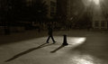
The version as submitted - made it to the 50/50 point in screening but didn't quite slip through. "Lacks impact" was the primary reason. No amount of improving via editing will change that one.
Well, to my eye, there is one thing you can do to change that one. Just remove the highlights in the upper area so there is no sign of the figure...just black shadow. The highlights slightly diminish the potential "mystery" (so to speak). But the legs, the angle of the feet with those shoes, they work with the shadow so well. And the shadow IS the picture (I'm sure you know that.) It IS mysterious. It is so oddly formed. The focus (pardon the pun) should be on that shadow. The legs are a perfect representation of its "origin" point. The highlights take it too much into normalcy.
Regardless, it is, at least to my eye, a compelling image.
For those of you who have less than stellar results at getting stuff posted at 1x.com, post your rejects here! My personal goal is 40 rejections by year's end, which is harder than it sounds and I may in fact have to revise that. Not that I expect any to get accepted to ruin that goal, but I'm kinda in the one-a-week upload-slot club (or will be here very shortly) and I do plan to only submit those shots with which I'm truly pleased.
My most recent rejection:
The version as submitted - made it to the 50/50 point in screening but didn't quite slip through. "Lacks impact" was the primary reason. No amount of improving via editing will change that one.
Well, to my eye, there is one thing you can do to change that one. Just remove the highlights in the upper area so there is no sign of the figure...just black shadow. The highlights slightly diminish the potential "mystery" (so to speak). But the legs, the angle of the feet with those shoes, they work with the shadow so well. And the shadow IS the picture (I'm sure you know that.) It IS mysterious. It is so oddly formed. The focus (pardon the pun) should be on that shadow. The legs are a perfect representation of its "origin" point. The highlights take it too much into normalcy.
Regardless, it is, at least to my eye, a compelling image.
i downloaded and did what you said. It definitely improves it a lot.
Well, to my eye, there is one thing you can do to change that one. Just remove the highlights in the upper area so there is no sign of the figure...just black shadow. The highlights slightly diminish the potential "mystery" (so to speak). But the legs, the angle of the feet with those shoes, they work with the shadow so well. And the shadow IS the picture (I'm sure you know that.) It IS mysterious. It is so oddly formed. The focus (pardon the pun) should be on that shadow. The legs are a perfect representation of its "origin" point. The highlights take it too much into normalcy.
Regardless, it is, at least to my eye, a compelling image.
Two people in "critique" at 1x thought the dark section was TOO dark - unnaturally so - and wanted MORE highlights on the person. The dark is, however, "natural", as that's a section of light illuminated by sun coming through the windows near the roof. May play with it again and try your suggestion - very much appreciate you taking the time! (Though I've learned that resubmitting isn't always worth it there unless there was an obvious flaw. If it was a matter of taste or "impact", I'm thinking one try through is sufficient.)
Iraklis, what software are you using? The only critical thing would be to put things in the correct colorspace. Save for web strips the exif (if you're talking the Photoshop save for web feature - not sure on other software packages.) Make sure you resize for there - don't use DPC sizes. I think you can go up to 950 pixels on the horizontal, not sure on the vertical.
Well, to my eye, there is one thing you can do to change that one. Just remove the highlights in the upper area so there is no sign of the figure...just black shadow. The highlights slightly diminish the potential "mystery" (so to speak). But the legs, the angle of the feet with those shoes, they work with the shadow so well. And the shadow IS the picture (I'm sure you know that.) It IS mysterious. It is so oddly formed. The focus (pardon the pun) should be on that shadow. The legs are a perfect representation of its "origin" point. The highlights take it too much into normalcy.
Regardless, it is, at least to my eye, a compelling image.
Two people in "critique" at 1x thought the dark section was TOO dark - unnaturally so - and wanted MORE highlights on the person. The dark is, however, "natural", as that's a section of light illuminated by sun coming through the windows near the roof. May play with it again and try your suggestion - very much appreciate you taking the time! (Though I've learned that resubmitting isn't always worth it there unless there was an obvious flaw. If it was a matter of taste or "impact", I'm thinking one try through is sufficient.)
I'm sorry but I have to chuckle at the "too dark". It reminds me of the scene in the movie AMADEUS where the king (emperor?) said to Mozart there were "too many notes". I persist in my vision - that shadow is special - it is the focal point - any attempt to highlight that which caused the shadow would diminish the shado (in my opinion, of course).
I think it is a damned good composition, even as it stands. I am curious how you feel about keeping the entire upper body in blackness.
And forget about how 1X feels. Most important is how you feel. Dagnabbit! :)
Cheers Melethia... will try a few more pics and hopefully get a better feel of the place... Some great images there, thanks for giving me the heads up!
I just had another thought, Melethia. How about, instead of putting all of the upper body in black, cropping off from the top - to just a bit below where the upper body highlights end? I think the real legs would "dance" more and more closely relate to the shadow.
Let me tell you this shot is full of possibility and potential with just some simple edits. It really is compelling to me.
I just had another thought, Melethia. How about, instead of putting all of the upper body in black, cropping off from the top - to just a bit below where the upper body highlights end? I think the real legs would "dance" more and more closely relate to the shadow.
Let me tell you this shot is full of possibility and potential with just some simple edits. It really is compelling to me.
I have a hard time believing this got rejected. It has such a Renaissance feel and also a modern feel. For me this is perfect as it is. Saw and commented in your portfolio. Nice to see the original color shot there. Your conversion is inspired. If I may say so - ^%&^^#$ Ix for rejecting this one! :)
I just had another thought, Melethia. How about, instead of putting all of the upper body in black, cropping off from the top - to just a bit below where the upper body highlights end? I think the real legs would "dance" more and more closely relate to the shadow.
Let me tell you this shot is full of possibility and potential with just some simple edits. It really is compelling to me.
Very nice edit! I'll take another stab at it later today. And yes, I still am very fond of the photograph. Just because it got rejected doesn't mean I don't like it anymore. :-)
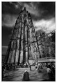
Rejected:
Marked at around 30% popularity
Of those who voted against your image, six indicated that there is a problem with impact, two noted composition as a weakness and one selected color as a reason for not publishing the image.
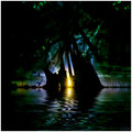
This one almost made it, might apply a re-edit to it and resubmit.
Popularity: ~50
Of those who voted against your image, six indicated that there is a problem with impact, two noted composition as a weakness and two selected color as a reason for not publishing the image.
Had a few nice and constructive comments. Most mentioning they dont like the bright background. But I like it glowing like that. I think it just doesn't fit the mood of the site.
hey deb melethia..
wot a great idea for a thread .. !!
i've had a few rejects and because i love dpc and dont have a lot of time to spare in another site, i wonder if i'll keep trying .
but these are the ones that they didnt like ..
this hasnt been rejected yet, but after posting to this thread i'm going to put it in for selection ..
i'll bet $10 that it will get rejected so i'm putting it in here in anticipation of winning the $10 from anyone who'd take me up on the bet .. lol ..