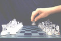
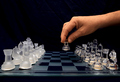
I saw them instantly. Looks like a dark blue velvet curtain with wrinkles running from left to right -- and a horizontal wrinkle (?) just above and to the left of the hand.
I see exactly the same. Very, very visible. LG E200 notebook 12.1” WXGA(1280X800) not calibrated.
Mine's calibrated and I see blue wrinkled. It's definitely not a solid colour. Maybe doing a curves adjustment, selecting the black point as the lightest point in the background. Also, running your cursor around the image in PS will tell you whether it's black or not.
I didn't see it until I downloaded it and pumped up the brightness... Perhaps I should un-calibrate my monitor.
I could have brand new black velvet, ironed and spend three days on the shot and not get in the top 50. I am amazed that people like Judi can throw a wrinkled old back drop up and come close to a ribbon.
Here's a brightened version for those of you that can't see the wrinkles.
Edited:
I can just see the wrinkles with my monitor but I have to be at the right angle. My personal opinion is it's not enough to worry about because it still made top 10. Congratulations by the way Judi!!
If it means anything, on my 3rd monitor I can still see the backdrop, and on this one I cannot see the difference between the last two black squares in the challenge voting view strip (the one that goes from white to black) so the monitor is definitively not cranked up in brightness.
Again, the lines are there, and most likely would have shown up in the print if one was made out of that jpeg. However, as I said before, I like the shot even more with it, but that's just me. I like the imperfection these days more than ideal, filtered out noiseless images...
I can see some very faint blue wrinkles on my uncalibrated monitor at home. I'll take another look in the morning on the one at work, which is calibrated.
Edited to add: On my calibrated monitor at work the wrinkles are more clearly visible.
I see a pure black background. My screen is calibrated. On my laptop..I can see the wrinkles, not calibrated. I have had several submissions (including a current one) where this very thing has happen to me.
But on the laptop, i see all black, on the other, I have cranked teh brightness up, so I can compare my editing with the laptop screen. So on that i can see the blue.
It has really helped me see things differently haveing the 2 screens,
My screen is uncalibrated, and the background is obvious (the first thing I noticed). I'm confused about why an uncalibrated monitor would show more detail than a calibrated one. Any ideas?
My screen is uncalibrated, and the background is obvious (the first thing I noticed). I'm confused about why an uncalibrated monitor would show more detail than a calibrated one. Any ideas?
Think of color slides being projected on a screen: too bright a bulb, too close to the screen you have a washed out looking projected image. Too dim a bulb, too far from the screen, you have a murky, dark image. Monitors are like that, the image you are viewing is a "projected" image; as opposed to a print, where the image is "reflected", formed by light bouncing off a surface (the paper).
Any monitor, basically, can be adjusted so it is "too dark" or "too bright". How do you know which is which? For all practical purposes, if you process an image so it prints properly, then you know your monitor is calibrated correctly if what you see on the monitor is the same as what you see in the print. If your monitor calibration doesn't agree with what you are printing out (prints look darker or brighter than the monitor image) then you have a problem.
It's actually much more complicated than that when you get down to the nitty gritty (you need to take into account printer profiles and a bunch of other things) but the principle obtains: "too dark" and "too bright" only have meaning if they are measured against some reasonably objective standard.
My screen is uncalibrated, and the background is obvious (the first thing I noticed). I'm confused about why an uncalibrated monitor would show more detail than a calibrated one. Any ideas?
Think of color slides being projected on a screen: too bright a bulb, too close to the screen you have a washed out looking projected image. Too dim a bulb, too far from the screen, you have a murky, dark image. Monitors are like that, the image you are viewing is a "projected" image; as opposed to a print, where the image is "reflected", formed by light bouncing off a surface (the paper).
Any monitor, basically, can be adjusted so it is "too dark" or "too bright". How do you know which is which? For all practical purposes, if you process an image so it prints properly, then you know your monitor is calibrated correctly if what you see on the monitor is the same as what you see in the print. If your monitor calibration doesn't agree with what you are printing out (prints look darker or brighter than the monitor image) then you have a problem.
It's actually much more complicated than that when you get down to the nitty gritty (you need to take into account printer profiles and a bunch of other things) but the principle obtains: "too dark" and "too bright" only have meaning if they are measured against some reasonably objective standard.
R.
On that note....my Monitors are calibrated. I send all my printing to Brisbane (1000 kilometers away). 24 hours after uploading my order, I have my prints on my front patio. And guess what...they look the same as what I see on my Monitor. My prints cover a huge range from food to action, colour to black and white, studio to outdoors.
How does this relate to what we are discussing here.
Easy. My prints come back looking how they look on my Monitor.....therefore...the Chess image, that looks BLACK on my monitors will come back from my printers, black. Therefore...the ones that see the blue or wrinkles....are either looking at the screens at odd angles forcing the light to pick up different shades....or your monitors are not calibrated.
I am not saying this is a bad thing...but as I said earlier....it makes one wonder how much this type of issue effects voting on your entries and others entries.
The first time I just noticed the "thing" under the first soldier but I liked the perspective and thought I could try to do something like this myself.... now I also see a blue wrinkled background.
I'm still learning about all the technological aspects of photography, so maybe I'm just naive, but if you want to have a flat black background, why wouldn't you shoot in front of a flat black background?
You're right though, if I hadn't have tilted my screen it would have looked black, but I wanted to know what the fuss was about.
I'd sure love to be able to send my images to a printer and have them look the same as they do on my monitor! The place I send them to, cuts of the edges. :(