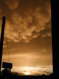
I've always wanted to see just exactly how much photoshopping goes on with many of the ribbon winners. Don't get me wrong, I'm not complaining or trying to start a rant about rules and processing. I'm just curious to see the differences. Would any recent (or past for that matter) ribbon winners be willing to post a "before and after" image of their winning entries? Not sure if anyone else would find this of interest, but I sure would.
I know that my (admittedly few) entries will never achieve greatness, and I know part of that is my lack of post processing experience. I love this place for learning and getting comments and ideas. And I think seeing the before and after would add to that learning experience. To realize what is possible. I'm sure there are many out there who could take a mediocre original and make something truly beautiful out of it.
That is a good place to start, but I would also like to see original vs. entry. I don't know much about photoshop, but even my entries often look a lot different than the original
LOL - you can see mine once it gets DQ-ed. Dang. I went overboard, I think, on my Yellow III entry. I guess I don't know what Advanced Editing means, exactly. I am better off sticking with Basic Editing, like before I became a Member. I thought it came out beautifully and that I followed the rules, but maybe I didn't. We will see once Site Council reviews it.
If it gets the thumbs down, I will put it in this thread.
No ribbon, but my highest-scoring image. Not much Photoshopping except for cropping/rotating.
I put a link to the original in the discussion thread on the image -- I recommend that too.
Entry: Original:
My current 2002 entry would be a better example, but I can't post that yet ...
Here ya go. Contrast masking, some crop, bump in blue/cyan and red-channel saturation is basically what it took:
As entered
Original
It may look like a lot of saturation bump, but it wasn't actually that much on the slider. It looks more like I "saw" it in the edited version than in the original, as that RAW's low-contrast, low-saturation...
It is refreshing to me to see both Anastasia's and Kiwiness's image comparisons above. They are exactly like what I see all the time that need post processing to make them the vision the photographer had in mind when taking the pictures originally. No surprise from such great photographers.
WOW! I could not do this even having her steps in front of me! I've got to learn to dodge and burn (for starters).
Yeah, exact same with me. This gives me a little bit more faith in my photography skills at least, because more and more I am learning that my post processing really stinks.
As I said in my submission comments, I had to do a lot of "resurrecting" on the original version of my Best of 2005 image in order for it to fulfill my original vision for it.
As I said in my submission comments, I had to do a lot of "resurrecting" on the original version of my Best of 2005 image in order for it to fulfill my original vision for it.
original
submitted
That's one HELL Of an example of post-processing...
As I said in my submission comments, I had to do a lot of "resurrecting" on the original version of my Best of 2005 image in order for it to fulfill my original vision for it.
i thought my spam image was pushing it. holy smokes ! ;}
Originally posted by jemison:
As I said in my submission comments, I had to do a lot of "resurrecting" on the original version of my Best of 2005 image in order for it to fulfill my original vision for it.