| Image |
Comment |
| 07/13/2016 07:46:16 PM |
B O O M ! ! !by Ja-9Comment by snaffles: Greetings from the Critique Club!
Nice fireworks shot, pretty colours, the red white and blue. Good exposure, really nothing to complain about with the shot itself. I think though that the lack of a physical setting, with people watching/cityscapes in bg to give it a sense of place, that this shot has fitted itself into a very generic category. In that while an excellent shot, there is nothing to give the viewer to relate to. That relatability is so important!
Hope this helps,
Susan |
 Photographer found comment helpful. Photographer found comment helpful. |
| 07/13/2016 05:30:49 PM |
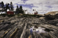
Pemaquid Lighthouseby Ja-9Comment by snaffles: Greetings from the Critique Club!
Lovely shot, Janine, very well seen and initially I was puzzled by why it didn't do as well as I think it should have in voting.
I certainly approve of the pov here, great leading lines up those rocks to the buildings beyond, and that reflection is just magic. Nice colours and tones. The whites do blend a little into the sky, shooting a bit faster may have helped there.
But I think the big problem is that red shed on the left. It's just there, and unfortunately as it's such a strong red, it grabs the eye and doesn't really let it go. Crop out that whole left quarter, and you have a much stronger shot, with the eye looking at the buildings and that reflection.
Hope this helps
Susan |
| Photographer found comment helpful. |
| 07/13/2016 03:48:22 PM |
|
| Photographer found comment helpful. |
| 07/13/2016 02:41:44 AM |
|
| Photographer found comment helpful. |
| 07/11/2016 03:42:04 PM |
|
| Photographer found comment helpful. |
| 07/08/2016 11:45:30 AM |
|
| Photographer found comment helpful. |
| 07/07/2016 03:23:33 PM |
|
| Photographer found comment helpful. |
| 07/06/2016 01:20:46 AM |
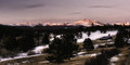
Alpine Glowby Ja-9Comment by sidpixel: Hello from the critique club
An appealing image that meets the challenge
I’m glad I tilted my laptop to see the truer colours at the angle I was viewing it it looked to have too strong a magenta tint but it looks much better now! A lovely landscape with the building forming a good strong focal point in an appropriately positioned composition. A good exposure with the whites well handled. The only minor criticism is that the foreground tree has a somewhat blocking effect being so large and dominant, it would be nice if we had a space that leads us naturally into the image but I suppose you left your chainsaw at home!
A lovely image Janine, thanks for your entry |
| Photographer found comment helpful. |
| 07/05/2016 01:32:38 PM |
|
| Photographer found comment helpful. |
| 06/30/2016 09:41:36 PM |
|
| Photographer found comment helpful. |
Theme:
Classic /
Light /
Dark
Home -
Challenges -
Community -
League -
Photos -
Cameras -
Lenses -
Learn -
Help -
Terms of Use -
Privacy -
Top ^
DPChallenge, and website content and design, Copyright © 2001-2026 Challenging Technologies, LLC.
All digital photo copyrights belong to the photographers and may not be used without permission.
Current Server Time: 10/06/2026 09:11:14 AM EDT.