| Image |
Comment |
| 05/22/2015 10:42:53 AM |
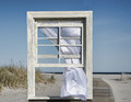
Light as The Breezeby DCrest01Comment by JakeKurdsjuk: Love the image. Would like a little more space under the window frame (or less at the top), and the frame squared to the horizon would be nice too. |
 Photographer found comment helpful. Photographer found comment helpful. |
| 05/21/2015 06:17:58 PM |
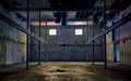
Lostby DCrest01Comment by BrennanOB: Glorious light with interesting asymmetry. I like the blues and the yellows with that hint of pink at the ceiling. It reminds me of the work of Robert Irwin.
My one quibble is the skewed roof beam. It would have made a more pleasing image (for me alone perhaps) had you skewed the image to justify that beam and the side walls from keystoned,into perfect symmetry to allow the walls and the decayed roof to be the only things out of balance. It is pretty easy to do and legal in this rule set, and the sort of edit that would have stilled the image into a pure exploration of light |
| Photographer found comment helpful. |
| 05/21/2015 04:57:57 PM |
Lostby DCrest01Comment by streetpigeon: There's a clinical feel to this brought on by the sharp angles and edges, despite the evidence of dirt on the floor and a tattered ceiling. What makes this image for me is the overall iridescence. There's a sense of expectation here, as if the building itself is going to pull off some transformative miracle. Fine capture of this elusive atmosphere. |
| Photographer found comment helpful. |
| 05/21/2015 08:58:57 AM |
|
| Photographer found comment helpful. |
| 05/19/2015 11:49:05 PM |
Light as The Breezeby DCrest01Comment by Melethia: Something kinda strange going on on the right side of the window frame near theh bottom but I can't quite tell what it is. Anyway, interesting interpretation! |
| Photographer found comment helpful. |
| 05/19/2015 06:43:13 PM |
|
| Photographer found comment helpful. |
| 05/18/2015 02:57:19 PM |
|
| Photographer found comment helpful. |
| 05/18/2015 12:17:01 AM |
Light as The Breezeby DCrest01Comment by buzzrock: Sometimes a photo just jumps off my monitor and screams!!
This is probably the most "technically" best in the contest..
Its so great!
10+ |
| Photographer found comment helpful. |
| 05/17/2015 10:35:24 AM |
Lostby DCrest01Comment by Zita: It would be really nice to see this on the front page. Compositionally it is top notch: finely balanced, strong leading lines, well lit, nicely processed, tack sharp. Just superb technical work.
Where it goes wrong with me, personally, is the lack of pathos. It is clearly an abandoned, neglected building but there is nothing there to wrench the heart. For me, it is simply too sterile.
Don't misunderstand, were I voting, this would be a nine from me simply on technical merits. Quite sincerely, I hope this ribbons for you. Best of luck. |
| Photographer found comment helpful. |
| 05/15/2015 12:52:47 AM |
|
| Photographer found comment helpful. |
Home -
Challenges -
Community -
League -
Photos -
Cameras -
Lenses -
Learn -
Help -
Terms of Use -
Privacy -
Top ^
DPChallenge, and website content and design, Copyright © 2001-2026 Challenging Technologies, LLC.
All digital photo copyrights belong to the photographers and may not be used without permission.
Current Server Time: 06/17/2026 04:06:36 AM EDT.