| Image |
Comment |
| 05/23/2007 09:00:50 AM |
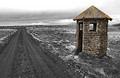
Round Cornersby orvaratliComment by wooglin: This could have been a excellent photo as opposed to a good one if you had croped to correct the center alignment of the building. Still I like the shapes. Kudos on a good photo. |
 Photographer found comment helpful. Photographer found comment helpful. |
| 05/22/2007 05:59:02 PM |
|
| Photographer found comment helpful. |
| 05/22/2007 09:57:20 AM |
|
| Photographer found comment helpful. |
| 05/21/2007 07:33:05 PM |
|
| Photographer found comment helpful. |
| 05/21/2007 08:47:22 AM |
|
| 05/21/2007 12:45:37 AM |
Dreaming of a Placid Lakeby orvaratliComment by ericwoo: Hey there from the Critique Club
Camera Work/Technical: Very nice, strong image with some great near-silhouettes. I like your coloring, but that 13 seconds produced some pretty strong ghosting.
Lighting: Overall, the lighting looks a little flat. I guess that it was pretty dark out there, huh? I think a little curves adjustment would have helped out your lighting a bit.
Composition/Content: Your test placement is a bit awkward, but I really like your composition. You have leading lines all over that work to draw the eye in and around the entire image.
My Opinion: This is definitely a stronger image that the score reflected. With better text placement and a little more contrast, I think that this would have scored much better. Even with it as it is, 5.2 is far too low. Darn voters.
Thank you for the opportunity to provide a critique on your entry,
Eric
|
| Photographer found comment helpful. |
| 05/16/2007 12:27:26 PM |
Dreaming of a Placid Lakeby orvaratliComment by Melethia: Nice shot - like the reflection! The title seems more an album title than a band, and the aspect ratio doesn't quite look like a CD or album cover, which may or may not be affecting your score depending upon the mood of voters. |
| Photographer found comment helpful. |
| 05/15/2007 11:14:31 AM |
|
| 05/15/2007 09:14:49 AM |
|
| Photographer found comment helpful. |
| 05/14/2007 06:11:28 PM |
|
| Photographer found comment helpful. |
Home -
Challenges -
Community -
League -
Photos -
Cameras -
Lenses -
Learn -
Help -
Terms of Use -
Privacy -
Top ^
DPChallenge, and website content and design, Copyright © 2001-2026 Challenging Technologies, LLC.
All digital photo copyrights belong to the photographers and may not be used without permission.
Current Server Time: 09/05/2026 07:42:28 PM EDT.