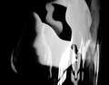
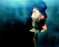
Comment by enajj: ha, clever. I like the red against black and white. Did you find this guy graffitied somewhere or draw him up yourself? Either way, very cool.
Comment by littlegett: Interesting concept though the colours look extremely fake, as if used with a brush and added elements. In the end it just doesn't hold much weight.
Comment by raish: Ya boo about the dq etc. I suppose there's too much dead space/ uncomposed space - ahem - ok, you got me, I don't know what I'm talking about
but the basic idea (?) of the profile and the cutout mask profile is superb. Thanks.
Comment by xianart: your new style of working is really resonating with me greatly. the colours and tones in this one are simply gorgeous - rich and jewel-like. the awareness and use of negative space are superb, with the emptiness and subject balancing each other in perfect unevenness. the graininess works very well too, and the repetition of the man's profile, positive and negative, left and right, is wonderful.


 Photographer found comment helpful.