| Image |
Comment |
| 02/15/2008 07:08:40 PM |
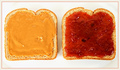
PB&Jby EstimatedEyesComment by oscarthepig: This isn't the way one normally sees a pb&j, and that's what makes it good. The symmetric composition is cool. If you got rid of the shadows and crumbs, this would be right at home next to Worhol's soup cans. |
 Photographer found comment helpful. Photographer found comment helpful. |
| 02/15/2008 04:03:53 PM |
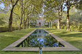
Blake Houseby EstimatedEyesComment by puzzled: The reflection in the water is gorgeous. The parts other than the water, however, are too processed (tonemapping or shadow/highlight) for my taste, particularly the greens. There's a nice depth in the colors shown in the water that seems to have been removed from the rest of the image. The water part is really great though. |
| Photographer found comment helpful. |
| 02/14/2008 11:14:23 AM |
PB&Jby EstimatedEyesComment by JulietNN: nice take on the challenge, the colours are vivid, it is all crisp and very clean to look at, well done |
| Photographer found comment helpful. |
| 02/14/2008 03:10:29 AM |
|
| Photographer found comment helpful. |
| 02/13/2008 10:55:12 PM |
|
| Photographer found comment helpful. |
| 02/13/2008 04:10:14 PM |
|
| Photographer found comment helpful. |
| 02/13/2008 02:15:05 PM |
|
| Photographer found comment helpful. |
| 02/13/2008 11:30:19 AM |
PB&Jby EstimatedEyesComment by raish: Over-sharp, over-saturated, possibly over-sharpened. I think some American people like the goop that's concealing the bread, but it looks pretty ghastly to me. Nice job of getting the subject isolated from the neautral background. |
| Photographer found comment helpful. |
| 02/13/2008 05:48:25 AM |
Blake Houseby EstimatedEyesComment by e301: Quite pleasantly geometrical; the processing feels over-forced though - the shadows are brought so far up that the light feels unbalanced, and there's a fringing to everything that feels unnatural - most especially visible in the edges of the trees against the sky. |
| Photographer found comment helpful. |
| 02/11/2008 02:51:31 AM |
Blake Houseby EstimatedEyesComment by daryn: Great composition, shame about the slightly blurred look. I'd also have kept the water a little darker to help the rest of the picture which is now overexposed. |
| Photographer found comment helpful. |