| Image |
Comment |
| 02/25/2003 08:30:16 AM |
"Marvin"by ladpupmoeComment by jmsetzler: cute shot.. I love marvin :) Good job withe lighting and the dark background.. - setzler |
 Photographer found comment helpful. Photographer found comment helpful. |
| 02/24/2003 06:29:41 PM |
|
| Photographer found comment helpful. |
| 02/24/2003 02:41:00 PM |
|
| Photographer found comment helpful. |
| 02/24/2003 11:56:10 AM |
|
| Photographer found comment helpful. |
| 02/23/2003 07:57:10 PM |
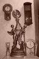
Tick-tock Tick-Tockby ladpupmoeComment by alanfreed: To me it seems a little too "tossed together"... a little too random, even though there are numerous clocks involved. The railing that runs vertically along the right hand side is also a bit distracting. |
| Photographer found comment helpful. |
| 02/21/2003 05:01:34 PM |
Beware of Dogby ladpupmoeComment by byetko: Greetings from the critique club.
Composition: It seems to me that you have two subjects fighting for attention. Of course the chihuahua is the main subject but the REALLY BRIGHT sign distracts me from the dog.
Technical: The entire shot is out of focus. I think you would have been better off if you either used a tripod or a faster shutter speed and maybe overexpose it a bit.
Overall: I think this would have done much better if the shot was brighter and you got rid of the sign. Message edited by author 2003-02-21 17:03:41. |
| Photographer found comment helpful. |
| 02/20/2003 06:14:34 PM |
Tick-tock Tick-Tockby ladpupmoeComment by kiwiness: The flash is very noticeable in the top right hand clock and the beam on the right I would have cropped out. But otherwise a good idea. |
| Photographer found comment helpful. |
| 02/20/2003 01:37:59 PM |
Tick-tock Tick-Tockby ladpupmoeComment by albright1: All the clocks make this a pretty busy shot, and my eye can't really figure out where to settle. Maybe just one of them would have been better. |
| Photographer found comment helpful. |
| 02/19/2003 08:32:33 PM |
Tick-tock Tick-Tockby ladpupmoeComment by wingy: The exposure seems too dark (especially on the upper right hand clock) and needs more contrast. Your center clock, because it is asymetrical itself, seems to throw off the balance of the shot (which I think is vital to this shot). The door frame on the right side should have been avoided. It seems the shot is also tilted to the left. The idea had some potential but the shot needs a lot of technical work. Good luck. 3 |
| Photographer found comment helpful. |
| 02/19/2003 01:56:49 PM |
Tick-tock Tick-Tockby ladpupmoeComment by jmsetzler: I understand the 'rhythm' idea you were going for here, but the photograph doesn't really show the 'repeating pattern' idea... the contrast also seems to be just a bit weak... - setzler |
| Photographer found comment helpful. |
Home -
Challenges -
Community -
League -
Photos -
Cameras -
Lenses -
Learn -
Help -
Terms of Use -
Privacy -
Top ^
DPChallenge, and website content and design, Copyright © 2001-2026 Challenging Technologies, LLC.
All digital photo copyrights belong to the photographers and may not be used without permission.
Current Server Time: 05/28/2026 02:41:49 AM EDT.