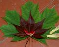
Red Maple ~ Green Mapleby
ladpupmoeComment by HBunch: *Critique Club*
This fits the challenge nicely. The red/green combo is nice, and the idea is creative.
The lighting looks a bit muted, like the lighting conditions were not ideal for this shot. It does make this seem a bit flat and lacks the depth I think it needs to stand out at us. Not that there really IS much depth, but some sun or something (but not too harsh) would help in my opinion.
Also, the focus seems a bit soft. It seems that there is a sharper focus in the upper right hand corner, and then the rest is a bit soft. It is really obvious if you look at the cracks in the tiles.
I do also think that a different background might have helped out some too. With the texture (cracks) in the background, I think that they take away from the texture of the leaves. Creating a bit of a distraction. There is that one crack that cuts all the way through the leaves. going from the upper right to the lower left. Cutting objects in half, even if from 'behind' bothers me for some reason.
I think that the idea is good. Quite interesting, and effective. Just a few minor adjustments and this could be great.
Oh, I will also mention that the seeds are a distraction in my opinion as well. I think that with the total green/red theme, the little white/yellowish ones really stand out more than anything, and on top of the cracks in the tiles, really take away from the image.
~Heather~