| Image |
Comment |
| 05/09/2006 11:16:02 PM |
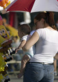
Parade vendors appeal to all agesby MelethiaComment by tngrndream: hello again,
he he he... my first thought was that some dude just took this to perv the lady. lol.
again, though i like this as a candid. it is not a front page story. maybe in a small town. but i think the front page is more of a large tent or a cool ride.
that is all i have for it. good shot but not photojournalism. imo. |
 Photographer found comment helpful. Photographer found comment helpful. |
| 05/09/2006 11:12:31 PM |
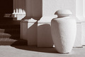
Light and shadowby MelethiaComment by tngrndream: hello again,
one of my favs. absolutely loved it. i liked the exposure (which had to be spot on in this one) and the position of everything including the sun and shadow. in my opinion you got totally robbed from not getting a ribbon. but that is just my opinion.
dont have anything negative. loved the shot. |
| Photographer found comment helpful. |
| 05/09/2006 04:00:08 PM |
|
| Photographer found comment helpful. |
| 05/09/2006 10:24:14 AM |
Light and shadowby MelethiaComment by kirsty_mcn: ~trading post~
Shame about the date, I also preferred the original, with much more soft, sensitive light. Nevertheless, this is a beautiful study and well-deserving of the score
Composition is strong, following the rule of thirds. Although I think I personally preferred the slightly wider view of the other version - seems to make it slightly less cluttered.
The lighting is what makes this shot - it shows off the texture of the wall and post.
I like the juxtaposition of the sharp lines and curves; especially with the additional element of the interplay of the shadows.
I'm not convinced by the toning, although I think thats partly just me - I always prefer a cooler tone on duotones. But I liked the treatment of the other version better |
| Photographer found comment helpful. |
| 05/09/2006 10:10:40 AM |
|
| Photographer found comment helpful. |
| 05/09/2006 06:16:48 AM |
|
| Photographer found comment helpful. |
| 05/09/2006 03:04:34 AM |
|
| Photographer found comment helpful. |
| 05/08/2006 10:48:14 PM |
Light and shadowby MelethiaComment by Louis: Lovely, lovely image, with soft shadows and interesting shapes that really stand out for me. I love the contrasts in the textures between the vase-shape and column, steps, and sidewalk (?). Colours are gentle, muted, and beautiful. Everything is set off so well, and I really start to get curious about where the steps are leading, and where this is. Composition really satisfies. Beautiful, congratulations. |
| Photographer found comment helpful. |
| 05/08/2006 02:46:09 PM |
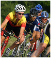
Delightfully Psychotic Cyclistsby MelethiaComment by UNTITLED: Very nice composition with the riders heading into the turn. Not sure about the inclusion of the hip though, distracts some. Good color and some pretty good expression on their faces. |
| Photographer found comment helpful. |
| 05/08/2006 02:26:15 PM |
Parade vendors appeal to all agesby MelethiaComment by kirsty_mcn: ~trading post~
This does look a very newspaper-ey photo in its context (local news with candids..) but as a photo could be improved a number of ways.
The composition seems to me to be very cramped, theres no room to breathe. The light is flat where you need it on the faces, because of the shadow of the umbrella.
Baby's head seems a touch soft - if this were sharper the dof would work better, cause the two would stand out together.
Composition is pretty centred as well as the crampedness, making it pretty undynamic
Also, at the end of the day it is rather a snapshot - that doesnt mean it doesnt suit photojournalism (well, some areas of photojournalism), but DOES mean it doesn't suit DPC voting. Its not a front-page-really-cool-shot but would suit local news brilliantly.
I think the score was reasonably fair, given that I reckon even the best photo taken in this 'style' would be hard to break a 5.5
PS as i went thru your profile to get here, couldn't help but notice your comments given:received ratio. Well done, its an amazing contribution :)
felt like adding smileyMessage edited by author 2006-05-08 14:27:53. |
| Photographer found comment helpful. |
Home -
Challenges -
Community -
League -
Photos -
Cameras -
Lenses -
Learn -
Help -
Terms of Use -
Privacy -
Top ^
DPChallenge, and website content and design, Copyright © 2001-2026 Challenging Technologies, LLC.
All digital photo copyrights belong to the photographers and may not be used without permission.
Current Server Time: 06/22/2026 05:55:19 PM EDT.