| Image |
Comment |
| 10/04/2008 10:39:09 PM |
Made in U.S.A.by Kari48Comment: Nice textures and angles. The parts in the bright sun are a little washed out. |
 Photographer found comment helpful. Photographer found comment helpful. |
| 10/04/2008 10:36:36 PM |
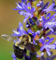
The Proletariatby CarpeLumenComment: Love the flowers. Great colors and nice DOF on them. The body of the bee is great, but the one wind has some highlights and the other sort of disappears wiht the angle here. |
| 10/04/2008 10:34:12 PM |
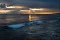
Honolulu Sunsetby chaliceComment: Pretty shot. I like the rays of the sun and the motion of the waves. Perhaps offsetting the sun from the center would give it more impact. |
| Photographer found comment helpful. |
| 10/04/2008 10:32:13 PM |
|
| Photographer found comment helpful. |
| 10/04/2008 10:31:05 PM |
Aloneby dwterryComment: Very edgy and cool. Like the red on the shirt. I am mixed on the vignette. The wheels in the front seem out of place. |
| Photographer found comment helpful. |
| 10/04/2008 10:29:16 PM |
Just Chillin'by Donna21Comment: Very clear and crisp focus. Nice composition. Upper grass looks noisy or pixelated. |
| Photographer found comment helpful. |
| 09/19/2008 01:31:01 PM |
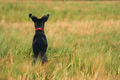
Peek a Boo!by LiamD2005Comment: I actually love that is the back of the dog and how the red collar stands out. The negative space on the right is nice as well and you could have cropped away more of the left and it would have worked as well. I think the background grass tends to blur more to a neutral color than a niceer looking bright color. I did not vote but this a 6 to me, so 5.3 sounds about right. |
| Photographer found comment helpful. |
| 09/03/2008 07:51:21 AM |
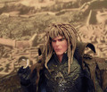
The Goblin King Contemplatesby Purple_GirlComment: Great idea -- Kudos. Wonderful lighting on the King's head and arm. Flash highights on chest detract. The DOF on the background is nice, although it bit faded -- TV screen maybe?
The Bog of Eternal Stench -- "Smellllsss Baaaaddd" |
| Photographer found comment helpful. |
| 08/28/2008 09:44:15 AM |
~Reflections of a Purple Plasmatini~by DamzelComment: The photo for me is mixed. I like the concept, but do not feel any part of it jumps out at me. While the result is colorful, none of the bands of colors stands out to draw your eye. The colors all seem a little random, perhaps some more symeetry would have helped. The highlights on the glass and bottem of the orange part detract a bit. I agree with the prior comment about changing to a horizontal crop would have made a huge difference. BTW finishing in the top half of any DPC challenge is always a good thing! |
| Photographer found comment helpful. |
| 08/13/2008 07:53:20 AM |
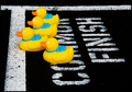
Olympic Gold by Two Beak Lengthsby ErikVComment: Great idea and well executed. Perhaps backing all the ducks up an inch so that the lead duck beak is just touching the finish line would improve the composition and story. |
| Photographer found comment helpful. |
Theme:
Classic /
Light /
Dark
Home -
Challenges -
Community -
League -
Photos -
Cameras -
Lenses -
Learn -
Help -
Terms of Use -
Privacy -
Top ^
DPChallenge, and website content and design, Copyright © 2001-2026 Challenging Technologies, LLC.
All digital photo copyrights belong to the photographers and may not be used without permission.
Current Server Time: 09/22/2026 07:52:06 PM EDT.