| Image |
Comment |
| 11/11/2009 05:00:14 PM |
Vinnie bookby whiterookComment: Interesting attempt at a different look. Love the expressions on the man's and dog's faces. Love the holes in the jeans.
The shot looks a bit grainy, and the red-purple lighting look on the man and dog looks like a mistake, rather than intentional.
|
 Photographer found comment helpful. Photographer found comment helpful. |
| 11/11/2009 04:56:16 PM |
really?by kitkatklokComment: I like the composition of your shot. You've basically used the rule of thirds to establish an inner border to the picture. A piece of life advice after reading others' comments on your pictures - just because some people come across as know-it-alls and eager to tell people what to do, does not mean their input is not valid, or not worth listening to. Learn what you can. Ignore the rest. You've done a great job of capturing a meaningful moment.
|
| Photographer found comment helpful. |
| 11/03/2009 07:36:25 AM |
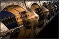
Leading Lines, Long Exposure, & Tilted Angleby NikonJebComment: Very nice! I like the way the top of the dam / bridge is parallel with the top of the shot, which then put all else perspective tilted. Beautiful lighting, and nice interest with the water stains down the sides of the pillars / arches. |
| Photographer found comment helpful. |
| 10/29/2009 09:42:52 PM |
Deer Point Conspiracyby JutildaComment: A world-class image, capturing a great moment, expressing great emotion, telling a story, and you, yes you did it. The quality was recognized by over 125 of some of the harshest critics in the world - many of whom had personal reasons to grade you down so they could do better (hold the fire - not saying people do, just that they have reason to...). Even without the validation of the others, this is an image you can be proud of for years to come. The DQ has absolutely no impact on the quality of the image. Plus, now you KNOW that YOU can get a blue ribbon on DPC. So sorry about the DQ, but the image is worth celebrating all in its own right.
|
| Photographer found comment helpful. |
| 10/21/2009 11:05:00 PM |
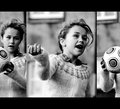
GoGirlGo!by gsalComment: Great expressions, but the ball-only right pane just doesn't work for me. The first two frames show a girl, then the right one shows just a ball - not what I would expect. Even if the center pane had the ball in it, it would make more sense. Good lighting. Picture frame in background is distracting in middle and right panes. |
| Photographer found comment helpful. |
| 10/21/2009 11:00:00 PM |
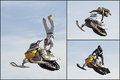
Freestyle Chaseby MGComment: What a great capture! IMO, the beveling around the edge of the photos did not help, nor does the black border. These shots want to fly - not be hemmed in with a stark border. |
| Photographer found comment helpful. |
| 10/21/2009 10:53:34 PM |
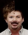
Three of a Kindby Art RoflmaoComment: This is good enough to fool the eye at first glance. Very well done. I thought ears grew as you get older, not shrink! |
| Photographer found comment helpful. |
| 10/21/2009 10:52:18 PM |
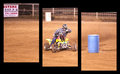
Barrelsby photopiaComment: Great Image. Love the sense of motion. Each pane has one object of central attention, but together they make one image. Even the stairstep down arrangement helps with the sense of movement. |
| Photographer found comment helpful. |
| 10/21/2009 10:51:17 PM |
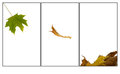
inevitabilityby LutchenkoComment: Falling. I like the simplicity of this. Nit - not sure I like left pane's stem going right up to corner. |
| Photographer found comment helpful. |
| 10/21/2009 10:50:29 PM |
A Day In The Sunby ReM_FrComment: Interesting concept, but the differences in lighting does not lend itself to putting these images together. Each individual pane is a beautiful and well done shot. |
| Photographer found comment helpful. |
Theme:
Classic /
Light /
Dark
Home -
Challenges -
Community -
League -
Photos -
Cameras -
Lenses -
Learn -
Help -
Terms of Use -
Privacy -
Top ^
DPChallenge, and website content and design, Copyright © 2001-2026 Challenging Technologies, LLC.
All digital photo copyrights belong to the photographers and may not be used without permission.
Current Server Time: 09/21/2026 02:06:55 AM EDT.