| Image |
Comment |
| 11/12/2021 02:46:18 PM |
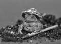
Toad4378Brby LydiaComment: This has to be a Lydia, surely? That said, I associate Lydia with colour. Super image with just the right depth of field. |
 Photographer found comment helpful. Photographer found comment helpful. |
| 11/12/2021 02:42:23 PM |
17by timfythetooComment: This model looks very familiar! Could it be an all grown up Rowan, I wonder? The style is very Timfythetoo. I love the way the character comes out in this portrait. Possibly slightly over whitened the eyes - dial that back, and it would be perfect. |
| Photographer found comment helpful. |
| 11/12/2021 04:15:51 AM |
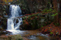
Long Time Runningby glad2badadComment: This really is a stunning landscape - I'd love to see the photo in a size larger than DPC allows. |
| Photographer found comment helpful. |
| 11/11/2021 12:51:48 PM |
Nude art Photographyby mshonakComment: What I like:
The high contrast mono palette
The lighting on your models breasts
The shape of your models breasts, accenuated by the angle you have chosen
The title of the book and choice and placement of lettering
What I am not so keen on:
The 'How to' lettering - the style seems wrong
the inclusion in the frame of the fabric (?) either side of your model - makes it look cluttered and distracts from the shape and form.
The central line that runs vertically from sternum to navel - I've never seen this as pronounced before.
The pose or the angle you have used doesn't, for me, work for the thighs and crotch area - all I can see is a chicken ready for the oven... |
| Photographer found comment helpful. |
| 11/11/2021 12:44:45 PM |
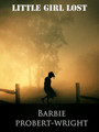
LITTLE GIRL LOST by NeatComment: The images, and the way they are combined and processed work exceptionally well as a book cover. I am not particularly keen on your choice of book title lettering. 7 |
| Photographer found comment helpful. |
| 11/11/2021 12:42:10 PM |
|
| Photographer found comment helpful. |
| 11/11/2021 12:38:17 PM |
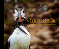
Peter the Puffinby vawendyComment: Well, I think that this is probably Wendy's. What I like:
the ratio is good for a coffee table book
the black spine extension works
the tonal ranged the colour and style of lettering
Good DOF for the puffin, sharp nearly throughout (just losing it on the most distended part of the belly).
What I am not so keen on:
The title is a bit naff - or at least, the Peter the Puffin part
I am pretty sure you have a better photo of a puffin than this - or at least, one with a cleaner belly. The puffin is sharp, including the critical tip of the bill. Shame the sandal isn't facing the camera more.
All in all a good entry, but not amongst my top picks. |
| Photographer found comment helpful. |
| 11/11/2021 12:31:48 PM |
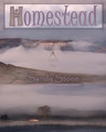
Sandy Stone's Homesteadby AmmieComment: I really like this very much, and would love to see more of your images in this style - looking forward to seeing whose work it is. In terms of this challenge, I love everything about your submission, with the exception of the ratio - for a novel, it seems a tad wide. 9. |
| Photographer found comment helpful. |
| 11/11/2021 12:29:51 PM |
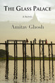
The Glass Palace by salmiakkiComment: Oh, this is really very good. My second 10 of the challenge. I particularly like the way you have included the softly opaque skyline. |
| Photographer found comment helpful. |
| 11/11/2021 12:28:19 PM |
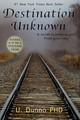
Destination Unknownby RefocusedComment: The base photograph is good, placement in the frame works well, but don't go a bundle on the lettering. |
| Photographer found comment helpful. |
Home -
Challenges -
Community -
League -
Photos -
Cameras -
Lenses -
Learn -
Help -
Terms of Use -
Privacy -
Top ^
DPChallenge, and website content and design, Copyright © 2001-2026 Challenging Technologies, LLC.
All digital photo copyrights belong to the photographers and may not be used without permission.
Current Server Time: 09/10/2026 09:48:37 PM EDT.