|
|
|
Showing 171 - 180 of ~1078 |
| Image |
Comment |
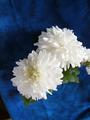
| 12/14/2002 12:02:28 PM | Out fo the Blueby amnonComment: Critique Club
#98
Composition/Content - I appreciate the composition of this image, and I agree with others about the distractions in the lower corners. I like the presence of the flower's shadow on the blue background. I like the angle in which the flower is positioned. I feel like its a good rule of thirds application. The green leaves nicely accents the two main colors.
Background - I very much like the diverse exposure, focus, shades and textures of the blue background.
Camera Work - Technical - I don't know what I'd do differently so I won't comment on this.
Digital Processing - Technical - I assume you deepened the saturation of the blue. I would've done the same. I like the choices of brightness and contrast.
Opinion - The image clearly meets the challenge, and can hold its own even if it weren't submitted to a themed challenge. I enjoy the white vs. dark blue contrast. |
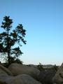
| 12/14/2002 11:25:00 AM | Not A Single Cloud In the ...by daysezComment: Critique Club
#144
Composition/Content - To me, the background is what sells this image, and what makes it worthy of the blue challenge. I think the composition is perfect as it is. Another image, from a different perspective could have been good too, but I would not flaw this image on compositional perspective. I also like the evolving shads of blue in the sky. My eye is drawn to the sky first, then the tree on the left, then the details in the middle ground, then the foreground.
Background - Again, the background makes this iamge what it is. Nuf said.
Camera Work - Technical - I disagree with the comment that the foreground needed to be brighter. As photographers we are all faced with the reality that some parts of our image will be in brighter light than others. We have to figure out the right balance for each image. In my opinion, you have done just fine with that. The tree on the left could quite possibly be sharpened, but I don't think this detracts from the image.
Digital Processing - Again, perhaps a little additional sharpness; perhaps not.
Opinion - I like it more as I look at it more. Now I noticed the pieces of mountain and valley bathed in sunlight. The photo has alot going for it. Congratulations. |
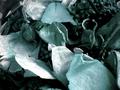
| 12/14/2002 11:01:06 AM | Cold Memoriesby GorpieComment: Critique Club
#190
1) Composition and Content - I like the composition. I like the subtle blue coloring very much (although I can understand how some would reduce this image's score on account of the lack of bold bright blue - I happen to be a fan of "subtle"). I like the non-blue elements. I'm guessing the photographer experimented with different croppings and perspectives. I like the ultimate choice. Great diverse textures. Wonderful idea for a photograph.
2) Background - I don't see alot of "background" in this image. To my eye, the material is sufficiently prominent to be considered part of the photo's subject. I think this is a good thing.
3) Camera Work - Technical - I like the exposure and focus choices that the photographer made. I think the low light gives the image "mood".
4) Digial Processing - I'm not that experienced enuf with digital manipulations to know what you might have done differently.
5) Opinion - Overall, my opinion of the photo is positive. I like the diversity of texture, colors and shades within the image. |
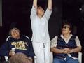
| 12/14/2002 10:49:28 AM | Three Generations In Blueby WRenComment: Critique Club Comment
#236
1) Composition - Content - Looks to me like you had little choice regarding composition if you were to preserve the spontenaiety. The spontenaiety is what make this picture interesting. The minor distractions on the upper left and upper right might would probably have been PS'd out if the DPC rules permitted it. Although strictly speaking there is blue in all three subjects' garb, the blue is almost irrelevant to the image. The point of the image, to me, is the three members of the family enjoying a special moment. I wish the middle subject's entire arms and hands were visible, but realize this might not have been possible in the moment.
2) Background - In my opinion the background neither improves nor detracts from this image.
3) Camera Work - Technical - The subject on the left image could probably be in slightly better focus. I don't have more to offer on technical choices that might have been made differently.
4) Digital Processing - Technical - I would've tried to "get more blue" out of the middle person's clothing, to emphasize it for purposes of this challenge. I would not have done this, however, if the photo were not for a challenge. I would have tried for a little more sharpness.
5) Overall, my opinion of the photo is mixed. I really appreciate the idea of three generations being represented in a single image. I enjoy studying the faces of the three people. To submit it to the blue challenge, however, is something of a stretch for me.
sjgleah |
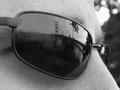
| 10/03/2002 12:27:00 AM | wineby whobeeComment: Nice idea. I wish there were something more interesting that was reflecting in the wine. .. or am i missing sometihng 5 sjgleah |
| 10/01/2002 01:43:00 AM | |
| 10/01/2002 11:06:00 PM | |
| 10/01/2002 11:09:00 PM | |
| 10/03/2002 12:30:00 AM | |
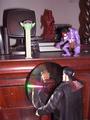
| 10/03/2002 12:23:00 AM | Desktop Managerieby hedonistComment: Generally I'm not very fond of staged pictures of toys. It meets the challenge so I'm comfortable giving it a 5. sjgleah |
|
Showing 171 - 180 of ~1078 |
Home -
Challenges -
Community -
League -
Photos -
Cameras -
Lenses -
Learn -
Help -
Terms of Use -
Privacy -
Top ^
DPChallenge, and website content and design, Copyright © 2001-2026 Challenging Technologies, LLC.
All digital photo copyrights belong to the photographers and may not be used without permission.
Current Server Time: 09/03/2026 01:38:15 PM EDT.
|