| Image |
Comment |
| 08/12/2006 03:16:24 PM |
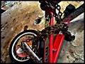
Adolescenceby The Resplendent SnippycatComment: I wish I knew what I was looking at. I'm not sure many people are going to know what they're looking at to be honest. The tilted angle isn't helping me figure it out either. So while my brain is trying to process what the subject is the photo is spinning! It hurts man.. it hurts! This would work if everyone knew what they were looking at. If it was product ad it might work.
I like the look and texture of the floor.. but I just can't look at this anymore, heh. |
 Photographer found comment helpful. Photographer found comment helpful. |
| 08/12/2006 03:07:48 PM |
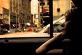
New York Minutesby roby21112Comment: My eye goes straight to the blurry "walk" sign, because it's almost dead center and is the brightest element of the photo. If the background didn't have that focus point my eyes would be more inclined to focus on the girl. One thing that could be done to lighten up the lower right and bring more attention to the girl might be to brighten up the watch band? Oddly this is one of those photos that probably would have done better had it been shot 1 second later once you go through that intersection and got that walk sign out of the center.
I am going to bump my rating on this photo from my original score. It is better than average. I like the idea.. the timing was just a bit off.. |
| Photographer found comment helpful. |
| 08/12/2006 02:58:01 PM |
early transportationby poindexterComment: Baby toes!
As much as I love baby fingers, the hand at the top is distracting. The strongest element of this photo is the shadows on the bottom left foot against the patterns of the blanket. I hope you don't mind, but I tried a few crops in PS just to see if a tighter crop would have accented the shadows more, but nothing I did looked right. I think the elements are there, but the angle seems to be fighting it. |
| 08/12/2006 02:42:06 PM |
Gone with the windby GunnsiComment: I think what people are going to want to see is more contrast with the white against the dark background. As it is now, it sorta blends in and nothing really stands out. I like that you caught the two pods flying away. I hope this photo doesn't suffer the wrath of the "doesn't meet challenge" brigade. I think the idea is very much "Transportation." |
| Photographer found comment helpful. |
| 08/09/2006 03:06:33 AM |
Blasting across the Bayby JEFFJSBComment: Sadly this is horribly grainy. It still works despite that, because the eye is drawn to the busy waters and the riders. |
| Photographer found comment helpful. |
| 08/09/2006 02:48:22 AM |
|
| Photographer found comment helpful. |
| 08/09/2006 02:38:34 AM |
|
| 08/09/2006 02:29:38 AM |
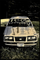
Ages 16+by 3eyedcrowComment: This is so well framed that I wonder how many people are going to try to get you DQ for adding lettering, heh |
| Photographer found comment helpful. |
| 08/09/2006 02:25:22 AM |
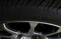
Americaby tonodzComment: You took a picture of your dirty tire =) |
| 08/09/2006 02:20:46 AM |
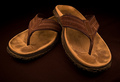
Well Worn Transportationby walrus451Comment: Love the colors and clarity. There's two specks of white that bother me. I can't help but wonder if you could have added some nature to the photo like a couple small autumn leaves. Good quality photo. I likes. =) |
| Photographer found comment helpful. |
Home -
Challenges -
Community -
League -
Photos -
Cameras -
Lenses -
Learn -
Help -
Terms of Use -
Privacy -
Top ^
DPChallenge, and website content and design, Copyright © 2001-2026 Challenging Technologies, LLC.
All digital photo copyrights belong to the photographers and may not be used without permission.
Current Server Time: 09/05/2026 10:13:09 AM EDT.