| Image |
Comment |
| 09/21/2009 08:22:49 PM |
You and Me are just Little Fishes...by raishComment: Commenting as part of my Team Suck duties...
Good use of HDR to get detail in the windons, facade and some of the sky, however, the colours are a tad flat and there's not enough pull to any point of interest in the image, so one's eyes just wander the image. |
 Photographer found comment helpful. Photographer found comment helpful. |
| 09/21/2009 08:19:30 PM |
Daybreak, Schoodic Peninsulaby Bear_MusicComment: Commenting as part of my Team Suck duties...
This is a stunning image and really deserves to have finished higher (IMO). It's yet another example from the Team Suck how to do HDR well... how to use the technique without overdoing it. Details and colours are brilliant. |
| Photographer found comment helpful. |
| 09/21/2009 08:15:03 PM |
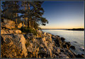
Evening glowby MelethiaComment: Commenting as part of my Team Suck duties...
Very nice image, and another good example of how to use HDR for good, and not evil, in that your image has benefited from the increase dynamic range w/o adopting all the usual HDR cliches of haloing, black clouds/skys, grittiness etc.
I love the detail, colour and composition. Well done. |
| Photographer found comment helpful. |
| 09/21/2009 08:10:08 PM |
The Sk8erby LadyKComment: Commenting as part of my Team Suck duties...
First... welcome back to the fold after serving your suspension...
A good capture, however, I think you've tried too hard to make it look like HDR... the overstauration, the haloing, the black grittiness... while all these are characteristics associated with HDR, they're not things that improve the image. I think there's stuff HDR processing can bring to an image w/o having to adopt these HDR cliche elements (IMO). |
| Photographer found comment helpful. |
| 09/21/2009 08:03:07 PM |
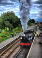
The Golden Age Of Steamby SteveJComment: Commenting as part of my Team Suck duties...
A good image. A little over saturated for my liking and I think it might have done better in voting with a tighter crop (top and bottom). Details are good, and you've the details in the smoke are brilliant. |
| Photographer found comment helpful. |
| 09/21/2009 07:59:03 PM |
Sammyby seeComment: Commenting as part of my Team Suck duties...
Great capture, and given the right challenge, this would have fair a lot better, but this doesn't lend itself to HDR (IMO). Colours are a little flat, and while I rate it as one of the images features, the lens flare probably hurt your score in the end too. Oh... also could have cropped just a tab more off the bottom to lose the white bit in the bottom right. |
| Photographer found comment helpful. |
| 09/21/2009 07:55:21 PM |
Ye shall not eat of itby posthumousComment: Commenting as part of my Team Suck duties...
I think the biggest issue with this image is the centred composition... that and the fact that it doesn't look HDR enough perhaps, though your faux-HDR processing did a decent job of giving the clouds a HDRish feel. I'd ask you not to give up on HDR... I think there's a lot of good Team Suck and the like could do, artistically, with HDR. |
| Photographer found comment helpful. |
| 09/21/2009 07:50:36 PM |
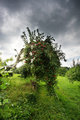
Van Gogh's Choiceby EmerkazaComment: Commenting as part of my Team Suck duties...
The composition and colours of this shot are good, however, the processing has left it looking very flat and unnatural... there's also a little too much going on above and behind the main flower which distracts the viewer away from the main subject. |
| Photographer found comment helpful. |
| 09/21/2009 03:16:14 AM |
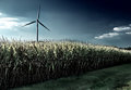
Windby colorcarnivalComment: Commenting as part of my Team Suck duties...
I commented on this during voting, and I have to now say, this is by far the most under rated, under appreciated image of the challenge, in that I think it deserves to finish MUCH higher, score MUCH higher than it did in the end. I think 6.8+ is more like where it deserved to be which would have put you in the top 10... in my books... even with the issues I highlighted in my original comment.
I love the composition... I love the colour of the sky. Hell, I like this so much, I think it deserves a fav. |
| Photographer found comment helpful. |
| 09/21/2009 03:11:36 AM |
quietudeby skewsmeComment: Commenting as part of my Team Suck duties...
I love this photo and am surprised it didn't do better in the challenge. I have no idea why, but perhaps b/c it may have been, as you said, not HDR-y enough. Shame. Composition, detail, colour... all wonderful, although, perhaps not enough colour for the DPC audience. That said, I wouldn't change a single thing in the image. Love it. |
| Photographer found comment helpful. |
Home -
Challenges -
Community -
League -
Photos -
Cameras -
Lenses -
Learn -
Help -
Terms of Use -
Privacy -
Top ^
DPChallenge, and website content and design, Copyright © 2001-2026 Challenging Technologies, LLC.
All digital photo copyrights belong to the photographers and may not be used without permission.
Current Server Time: 09/04/2026 10:00:40 AM EDT.