| Image |
Comment |
| 04/27/2005 11:43:39 AM |
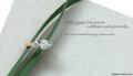
Diamonds are Foreverby slingshotComment: Nice concept. Lighting seems a little hot on the ring and flower stem. Multiple light sources may help with this. I like the style of text you used. Overall, nice job. |
 Photographer found comment helpful. Photographer found comment helpful. |
| 04/27/2005 11:30:49 AM |
|
| 04/27/2005 11:30:40 AM |
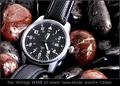
History In The Makingby RedOakComment: Wow! That watch face just jumps right out at you. Great use of the rocks and water...is this Lara? Lighting is great, focus is out of this world. Only negative I have, and it's hard to avoid, is I'm seeing some jaggies in the watch numbers, date border and watch hands. Nitpicky, I know. Hope you ribbon with this. Good luck. |
| Photographer found comment helpful. |
| 04/27/2005 11:29:43 AM |
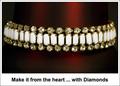
*by Moose101Comment: Ho-hum. Technically it's fine, just lacking something in the creativity department. I think it's the text outside the image in a plain white border that pulls the attention away from what is otherwise a nice image. It's like a MS Word document with a table and an image inserted with text put under it. Sorry if this comes across the wrong way...really. I like the image - just the total package isn't jumping out at me. |
| Photographer found comment helpful. |
| 04/27/2005 10:41:56 AM |
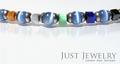
MAMBAby aznymComment: Looks like a snake at the top end! ;^) I like the color combinations you used for this. The text may be just a bit too subdued, but I like the choice of font style, size and color. Only wish I could see just a little more of the main piece of jewelry. Good luck in the challenge. |
| Photographer found comment helpful. |
| 04/27/2005 10:39:55 AM |
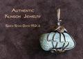
Gorcon's Fine Jewelryby Dr.ConfuserComment: Nice choice of background material. Interesting jewelry piece. Go Trekkies! ;^) No, I'm not one, but I used to watch the show. I think you've balanced this photo and text very well. The lighting and focus is fine too. Good luck in the challenge. |
| Photographer found comment helpful. |
| 04/27/2005 10:37:27 AM |
Irish Silverby banmornComment: Simple, to the point. I like it. Good choice of using black with the silver. Lighting is fine in my opinion, although I'll bet you will see a couple of comments that it's hot in a couple of spots. Good luck in the challenge. |
| Photographer found comment helpful. |
| 04/27/2005 10:07:25 AM |
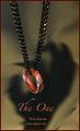
The Oneby jperez1690Comment: I must be missing something. The scary looking hand shadow, the red color cast...? Interesting photo. The lighting, composition, and details are very good. I think the red border distracts, but then you're probably trying to tie it in with the overall red tone. Good luck, this should make top 20. |
| Photographer found comment helpful. |
| 04/27/2005 09:56:50 AM |
Writing a Love Poemby admart01Comment: Cool props for your composition, it balances nicely. This would have really popped with a navy or black background behind the paper IMO. Good lighting on the ring (very nice diamond by the way...). Good luck in the challenge. |
| Photographer found comment helpful. |
| 04/27/2005 09:50:33 AM |
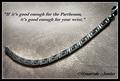
Silver Greek Key Design Bracelet...$129.95by CutterComment: Interesting choice of verbiage. Nice background choice for this piece of jewelry. Good composition with positioning of the necklace and text. Not sure about the choice of text for the jewelers name...hard to read. Good luck in the challenge. |
| Photographer found comment helpful. |
Theme:
Classic /
Light /
Dark
Home -
Challenges -
Community -
League -
Photos -
Cameras -
Lenses -
Learn -
Help -
Terms of Use -
Privacy -
Top ^
DPChallenge, and website content and design, Copyright © 2001-2026 Challenging Technologies, LLC.
All digital photo copyrights belong to the photographers and may not be used without permission.
Current Server Time: 09/26/2026 03:22:35 AM EDT.