|
|
|
Showing 681 - 690 of ~938 |
| Image |
Comment |
| 10/23/2005 01:50:19 PM | |  Photographer found comment helpful. Photographer found comment helpful. |
| 10/23/2005 12:46:00 PM | | | Photographer found comment helpful. |
| 10/23/2005 12:44:39 PM | | | Photographer found comment helpful. |
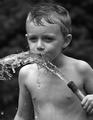
| 10/11/2005 11:36:14 PM | Hot Summer Dayby mawearComment: Salut from the critique club!
I love the energy of this picture. You immediately get the feel of a classic hot summer day, kids playing with the hose...
There isn't a lot for me to say, really.
Technically, it's excellent (not that I'm an expert on technical aptitude). It's compositionally excellent, and with your fast shutter, you got an excellent capture, where you can really see the drops off water.
I would say this is a little bit on the dark side. A slight boost in contrast or brightness would give the picture just a bit more lightness that would I think, improve the little things in the picture.
One things is his eyes, especially his right eye, is in the shadows. I'm not sure if the sun was off to the side, but in a picture like this, a little bit more light on the eyes so you could really see his expression in his eyes would be neat.
I've noticed both your entries so far have been black and white. Both your pictures entered so far are excellent. I don't know if you prefer black and white or not, but if you don't have a preference, try some color ones. This particular picture may have a different dynamic in color than in b&w
If you have any questions or anything, feel free to pm me. I'm no expert on photography, but I'm jsut trying to chip in here and there.
Happy shooting and I look forward to your future submissions!
Cheers
pidge | | Photographer found comment helpful. |
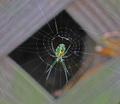
| 09/20/2005 09:26:03 PM | flourescent-spider.jpgby rox_roxComment: Very cool! I like how the background acts as a frame for the spider, yet the web is still seen through the whole picture. What a cool looking spider! I think mine is more flourecent though  | | Photographer found comment helpful. |
| 09/18/2005 11:46:23 PM | Special Branch?by mede61Comment: Salut from the critique club!
Mmm, you can almost smell the needles! Your picture has a neat twist with the different plant mixed in (I'm terrible with plant names... sorry!) On to the picture!
Color: First thing that I noticed is the color seems a bit flat. All I see is a lot of a sort of muted green. You've got two different greens in the picture, and enhancing them with either color balance, hue/saturation or selective color in photoshop could help bring out the yellows in the one tree and the greens in the other. Then you'd really see the difference between the two trees.
Light: I can't tell if you used a flash, but there seems to be a bit of highlight on the non-needled tree. I think a bit of adjusting with contrast/brightness will help balance out the lightness on those leaves.
Another option (if you used the flash) is to up your iso, or use a tripod so you can get the exposre you want without using a flash.
Focus: It seems as though it was a windy day, which has caused a bit of motion blur. I know it can be frustrating! Sometimes, if your with someone, and they don't mess up your light, you can have them block the wind. If that's not possible, open your aperture and up your iso so you can use a faster shutter speed.
Composition: Since I think your focus was on the lighter tree, and not the needles, you've done a good job of composition. The only thing I can see is it's a bit tight cropping on the lower left branch. One other little thing is I would have removed the dead leaf on the lower right.
I see this is your first entry to DPC. You're off to an excellent start. Welcome to the addiction, and happy shooting! If you have any questions, feel free to ask!
Cheers
pidge |
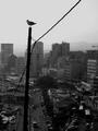
| 09/18/2005 09:40:26 PM | post light branchby chusterComment: Salut from the critique club!
You've got an excellent shot here, so most of what I say will be pretty picky stuff or relating to the challenge theme.
B&W: Excellent choice to use B&W here. It enhances the silhouette of the pole, wire and bird quite well. As stated in prior comments, it also creates an excellent 'old' feel which is very appropriate for the mood you've created with the picture.
Composition: The only thing is the pole seems to get lost in the buildings on the bottom. I feel that it wants to stand out as much towards the top as it does towards the bottom, and this is not happening. Perhaps there is a way to get a lower angle so more of the pole is against the sky as opposed to the buildings? This would also help to crop out the darker areas of the lower part of the picture, and the detials of the where the wire is connected to the pole would be better seen as well. The only other tiny thing is the crane that sort of sticks in on the right. I know this is an open challenge so you can't clone it out, but maybe a tighter crop on the right to get rid of it would be nice.
Sharpening: I feel the buildings are a touch soft, and a bit of unsharp mask in photoshop would help bring the details of the buildings out a bit. You don't list your post processing steps, so I don't know what you've used or not used on this picture.
As I said, you've got an excellent capture with the mountains in the background and the starkness of the bird on the pole against the backdrop.
Happy shooting and I hope this helps. Don't hesitate to ask a question if you have one
Cheers!
pidge |
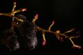
| 09/18/2005 05:25:38 PM | Grape gathering...by floipComment: Salut from the critique club!
Nice picture that fits the challenge quite nicely.
Composition: The placement of the grapes is excellent, and way the branch almost meanders through the picture gives it a great quality. I do feel the crop on the right is just a touch tight. I think a bit more space would help give the sense of the branch sort of trailing off into space.
Lighting: I noticed quite a few people felt the picture was a bit dark. I am inclined to agree for various reasons. One reason is that this picture is looked at on many different monitors, and not all will be able to handle the differences between true black and near black, making details lost in the picture and people scratching their heads wondering what they are looking at.
Another reason is you've used such dark grapes. With green grapes, or even those grapes what are brighter purple, they won't get lost in the background. Though the focus is the branch, the grapes are an important part of the picture, and they shouldn't get lost in the photo.
I'm not sure how strong your worklight is, but a stronger light would have brought out just a bit more of the grape and the excellent detail of water on it. I actually use a very strong flashlight to get some of my lighting stuff done since I don't have any good lighting equipment.
Sharpening: I noticed in your workflow, you didn't use unsharp mask. I think the details of the water on the grape would be enhanced if you used a bit of USM on the picture. As I'm sure you know, digital cameras tend to be a bit soft, and many people sharpen there picture as a last step in there work flow. Check the forums and this tutorial for more information about it if your not familiar with it.
I see this is your first entry to DPC! Excellent first entry, and good luck in the futuyre. Welcome to the addiction and I hope this critique was helpful. Enjoy your time here and happy shooting! If you have any questions, don't hesitate to ask me (or anyone else!)
Cheers
pidge |
| 09/18/2005 05:07:57 PM | life, the universe and everything. connected.by th3ph17Comment: Salut from the critique club!
First, I (personally) like how you are thinking outside the box in meeting this challenge. As I'm sure you saw by your comments, not everyone likes this. Not much one can do about that, but keep taking pictures! Now on to the photo
Title: The title is what more or less explains the photo to people. While many don't mind that, and think the title is an important part of the photo, others will wholeheartedly disagree, and think the photo should speak for itself. I don't mind the title, and I think it adds to the photo, but I'd like to warn you others, when voting, don't like to 'be told' what the photo is or how it relates to the photo. A classic example of people unhappy with titles was the Decisions Challenge where many stated the picture had nothing to do with the challenge except the title. It all comes down to what YOU want to do with the title, so follow your convictions and go for it!
Composition: The composition itself is pretty straight forward. Your eye is drawn horizontally across the center of the picture. Maybe next time, rotate the picture on a funky angle to see if it gives it a different dynamic.
Colors: The lights that are involved in this picture seem to be multi-coloured, but it seems to be lost due to the dominance of the light streak through the middle of the picture. I think some color adjustment to bring out the underlying colors would also add a different dynamic to the picture.
Noise: The lack of noise is excellent. I'm not sure what you used, but the lack of noise really helps make the lights the focus of the picture.
Exposure: I think if you lowered your iso to 200 or even 100, you would have prevented getting that very bright area the dominates the middle of the photo, and almost over powers the other colours as I stated above.
As a picture, this is a very interesting picture. As a picture for the branches challenge, it is definitely outside the box. This can be a good and bad thing, so be sure to take every comment with a grain of salt and keep taking pictures!
Hope this helps. Feel free to ask any questions!
Cheers
pidge | | Photographer found comment helpful. |
| 09/18/2005 12:14:38 PM | Early autumnby gsalComment: Salut from the Critique Club!
With your title, you've capture that autumn feel with the red of the needles from the tree, and met the challenge theme quite nicely. There are a few things that I think will help.
Size: Check out the tutorial on sizing images for DPC. DPC'ers not only don't like small pictures in challenges (many will vote it down!), but you lose detail when looking at a picture that is smaller than it could be.
Composition: Having the red needles follow the rule of thirds make this picture interesting and nice to look at. The only distracting thing is the thick trunk of a tree on the left. I feel it uneccessarily detracts from the focus of the picture, which is the red of the needles.
Focus: The small size of the photo makes it difficult to tell if how in focus the picture is. It seems as though the picture is not quite as sharp as it could be, but as I said, it's difficult to tell.
Color/Lighting: The light on the red needles is excellent. It makes the red really stand out. However, I think a little tweaking of color in post processing will not only bring out the red more, but improve the background colours so it stands out more. Red is a vibrant colour that your eye goes to, so adjusting the color can make it really POP against the background.
Depth of Focus: One way photographers make things stand out is by blurring the background of your photo. Check out this tutorial on depth of focus.
I see you've only entered two challenges so far. I hope to see you shooting more!
Hope this helps, and if you have any questions, feel free to ask!
Cheers
pidge | | Photographer found comment helpful. |
|
Showing 681 - 690 of ~938 |
Home -
Challenges -
Community -
League -
Photos -
Cameras -
Lenses -
Learn -
Help -
Terms of Use -
Privacy -
Top ^
DPChallenge, and website content and design, Copyright © 2001-2026 Challenging Technologies, LLC.
All digital photo copyrights belong to the photographers and may not be used without permission.
Current Server Time: 09/10/2026 09:56:44 PM EDT.
|