| Image |
Comment |
| 03/25/2004 11:26:40 PM |
Lighthouse Digestby LtHousLadyComment: Nice composition, and I like the 'halo' at the top of the lighthouse. Plenty of room for type, too. Unfortunately, the building is very dark, but not enough to be an intentional silhouette. I'll bet the shot would have scored 1.5 points higher by darkening the sky and dodging the building in Photoshop. |
| 03/25/2004 11:20:44 PM |
Sawasdee (In-Flight Magazine of Thai International)by librodoComment: This looks like the handiwork of librodo (and that's a compliment). Beautiful in color, content and technique. I'll assume the headline runs down the side of the photo and not across her face. Even with that, I'd still like to see more space around her head. Well done! |
 Photographer found comment helpful. Photographer found comment helpful. |
| 03/25/2004 11:05:36 PM |
TIME MAGAZINEby RtwoComment: Clever, and you obviously went to a lot of trouble. Unfortunately, I don't think this shot could, in turn, be effectively used as a magazine cover photo, and the cheap printed pen didn't help. Sorry! |
| 03/25/2004 11:01:23 PM |
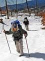
Marathon Runner Magazineby PaulMdxComment: Good shot for a magazine and nice DOF. Did you try cropping off-center? That might help to suggest movement and make the image more dynamic. |
| Photographer found comment helpful. |
| 03/25/2004 10:58:12 PM |
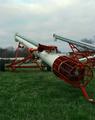
Farm Journalby weavercComment: Ah, Nebraska artillery. Nice exposure, dynamic composition and no question where the type goes. This shot would benefit from a nice sunset or puffy white clouds, but those can be tough props to find. Looks like you found a use for a Parallel Lines outtake, too ;-) |
| Photographer found comment helpful. |
| 03/25/2004 10:54:22 PM |
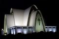
Daily Churchby russiComment: Cool architecture and quite clean for a night shot. You'd score higher with most voters by cropping more off the right and extending the black top & bottom for a vertical format. What's in the foreground? Looks almost like hooded Franciscan monks ;-) |
| Photographer found comment helpful. |
| 03/25/2004 10:50:47 PM |
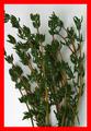
Thyme Magazineby dickwilhelmComment: Now that's funny! You might have gotten considerably higher votes with a title like, "Mad Magazine- the cover of Thyme," becuase this clearly wouldn't be used on a mainstream publication. |
| 03/25/2004 10:48:30 PM |
|
| Photographer found comment helpful. |
| 03/25/2004 10:47:46 PM |
|
| Photographer found comment helpful. |
| 03/25/2004 10:42:24 PM |
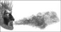
Smoke Magazine...by theodor38Comment: Good concept and plenty of room for type, although the exaggerated horizontal layout should test voters' perception of a magazine cover. The effects are cool, but end up looking far more like an illustration than a photo. |
Preview the new look -
Home -
Challenges -
Community -
League -
Photos -
Cameras -
Lenses -
Learn -
Help -
Terms of Use -
Privacy -
Top ^
DPChallenge, and website content and design, Copyright © 2001-2026 Challenging Technologies, LLC.
All digital photo copyrights belong to the photographers and may not be used without permission.
Current Server Time: 09/15/2026 07:56:31 AM EDT.