| Image |
Comment |
| 03/22/2012 03:29:37 PM |
|
 Photographer found comment helpful. Photographer found comment helpful. |
| 03/22/2012 03:26:17 PM |
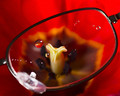
A good look at beautyby hajekaComment: Interesting. Lovely colours and good composition. Not sure why you needed the waterdrops on the glass? |
| Photographer found comment helpful. |
| 03/22/2012 03:23:34 PM |
|
| Photographer found comment helpful. |
| 03/22/2012 03:22:10 PM |
|
| Photographer found comment helpful. |
| 03/22/2012 03:20:47 PM |
|
| Photographer found comment helpful. |
| 03/22/2012 03:08:08 PM |
|
| Photographer found comment helpful. |
| 03/22/2012 03:07:54 PM |
Nibbleby mefnjComment: Very interesting, very different, very well done. |
| Photographer found comment helpful. |
| 03/22/2012 03:05:41 PM |
|
| 03/22/2012 03:05:00 PM |
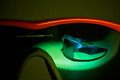
Product Placementby VenserComment: Nice - lovely clean lines, clean colours, great idea, great composition - 10 from me, hope you do well. |
| Photographer found comment helpful. |
| 03/22/2012 03:03:03 PM |
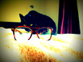
Curious Viewby RobynKComment: Love the way you processed this. I feel however, that the highligts in the blanket are too much and should have been toned down. |
| Photographer found comment helpful. |
Home -
Challenges -
Community -
League -
Photos -
Cameras -
Lenses -
Learn -
Help -
Terms of Use -
Privacy -
Top ^
DPChallenge, and website content and design, Copyright © 2001-2026 Challenging Technologies, LLC.
All digital photo copyrights belong to the photographers and may not be used without permission.
Current Server Time: 05/30/2026 10:23:58 PM EDT.