| Image |
Comment |
| 11/20/2004 12:10:20 AM |
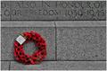
The wall of namesby MrYuComment: While it's neat to see the washington monument reflected here, to me it is only a distraction from the theme. To me, the heroes theme would call for a person to be reflected there, maybe in uniform, maybe a widow, etc. |
 Photographer found comment helpful. Photographer found comment helpful. |
| 11/20/2004 12:08:45 AM |
Many Heroesby peeceeComment: Very effective shot and looks carefully composed cropped for all the right elements. |
| Photographer found comment helpful. |
| 11/20/2004 12:07:07 AM |
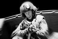
Ask Notby strangeghostComment: Excellent shot--I like added effect of the the motion blur too. Was this being shot for a movie (guessing from the black background and studio style lighting!) |
| Photographer found comment helpful. |
| 11/18/2004 08:14:16 PM |
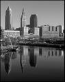
Shades of my cityby bobdaveantComment: Very nice, good tones and reflections. The buildings appear to be leaning to the right--a bit of camera tilt I presume. |
| Photographer found comment helpful. |
| 11/18/2004 12:53:59 AM |
Angel in a Wheelchair--Always Smilingby ccaseyComment: Nice shot, and I love the tones. To me, this would be improved by a crop on the top to get rid of the top, brighter portion of the hood, and also the front portion of the tray at the bottom. |
| 11/18/2004 12:52:00 AM |
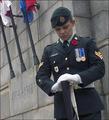
Remembranceby bongoComment: Very nice shot and one of my top selections for this challenge. IMHO it would have been better to include a bit more of the flags, or maybe all of them. |
| Photographer found comment helpful. |
| 11/18/2004 12:51:00 AM |
Accelerate Your Lifeby ChiquiComment: Wonderful composition, good color and either natural or selective desat of the background, and perfect match to the theme. I am predicting a ribbon here! |
| Photographer found comment helpful. |
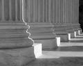
| 11/18/2004 12:30:15 AM |
Columns of Justiceby dtoombsComment: Super! I really like this. However, I think it would be even better with a crop at the top. That would put the diminishing part (via perspective) of the round part of the base into the diagonal of the shot (mostly). I am suggesting about cutting more than 1/2 of the vertical striped area of the columns in the crop: try it and perhaps you'll see what I mean. |
| Photographer found comment helpful. |
| 11/18/2004 12:24:32 AM |
$0.25by jjbates4Comment: Very nice! In an editing challenge, I would have liked to see the rail erased, but fine here. Good tones.
...Another alien caught on camera (see my portfolio and you'll see what I mean!)... |
| 11/18/2004 12:22:02 AM |
i doby sacredspiritComment: I like the dark tones and the negative space at the bottom. I am less sure of the crop you chose at the right. Personally, I think the head would have been good here, or at least the neck. More significantly however, the subject has lines from their clothes that are distracting to the tones and texture of the skin. Your model needs to avoid tight fitting underwear the day of the shoot. |
| Photographer found comment helpful. |
Home -
Challenges -
Community -
League -
Photos -
Cameras -
Lenses -
Learn -
Help -
Terms of Use -
Privacy -
Top ^
DPChallenge, and website content and design, Copyright © 2001-2026 Challenging Technologies, LLC.
All digital photo copyrights belong to the photographers and may not be used without permission.
Current Server Time: 06/23/2026 10:28:48 AM EDT.