|
|
|
Showing 2151 - 2160 of ~3840 |
| Image |
Comment |
| 07/17/2005 11:31:53 PM | Brothers and Best Friendsby L1Comment: Very sweet. amd well done. A bit of noise and blur, but the pose and expressions are priceless. In fact, the more I view, the more I think the motion blur adds to it. Good luck, one of my top picks for the challenge! |  Photographer found comment helpful. Photographer found comment helpful. |
| 07/16/2005 11:27:22 PM | | | Photographer found comment helpful. |
| 07/13/2005 10:46:52 AM | Glowing Shadowby Dax-Comment: Fantastic. This was way underrated. Composition, colors, sharpness, all superb. I am sure this looks even better in print. And wonderfully different in this large group of macros.
Thanks for your comment on my shot--it reminded me to visit your portfolio, which is always a pleasure, you do such great work! | | Photographer found comment helpful. |
| 07/13/2005 09:40:18 AM | | | Photographer found comment helpful. |
| 07/13/2005 12:02:20 AM | | | Photographer found comment helpful. |
| 07/12/2005 11:51:25 AM | Across the Riverby cpanaiotiComment: Landscape class exercise "analysis" (more critical than the usual DPC comment):
Hits. I love the perspective you chose for this shot. The inclusion of the lamp works very well and gives this great depth. The color of the buildings across the shore and the clouds are also exceptional.
Misses. Technically, it's exceptional. Subjectively--aesthetically--to me, this is a mostly cloud shot, and while the clouds and each of the other elements are exceptionally well presented, overall, it misses the beauty/peaceful/wow mark one can assign to the greatest landscapes. That's just my own personal "feeling" from this, as we all are "affected" by art. | | Photographer found comment helpful. |
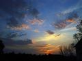
| 07/12/2005 11:39:02 AM | Morning Blanketby tcrock41Comment: Landscape class exercise "analysis" (more critical than the usual DPC comment):
Hits. Excellent shot, good use of layers of color, i.e., I love the subtle changes in color across the photo.
Misses. It seems to me there are some things to try with this photo that might make it even better. I like the bush in the foreground, but covering it with my hand, there's a suggestion that getting rid of it by cropping or cloning might enhance the layering effect of the scene. Hard to tell at this resolution too, but perhaps some noise reduction (small amount), might help it pop a little. Lastly, I can't really tell here, it might be a total illusion, but it gives the appearance of being pitched to the left a bit. See the bright light just below the trees for my reference point. |
| 07/12/2005 11:35:01 AM | Hilltopby tcrock41Comment: Landscape class exercise "analysis" (more critical than the usual DPC comment):
Hits: This is an almost perfect shot. Good color, composition, perspective, beautiful scene.
Misses: The only issue here to me is that the horizon is tilted to the right. Easy to fix in an editing program.
Next Time: A UV or polarizer filter might give more depth and pop to the clouds. |
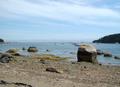
| 07/12/2005 11:33:10 AM | The Seaby tcrock41Comment: Landscape class exercise "analysis" (more critical than the usual DPC comment):
Hits. Good colors, good depth of field, good sharpness. I like the use of foreground here to bring the viewer into the photo.
Misses. However, in this case the background elements are small/far away and the foreground dominates instead of leading in. Perhaps if that one big rock weren't there, or you shot from a slightly different angle to exclude it, it would have been a better use of foreground lead-in. |
| 07/12/2005 11:30:23 AM | Color Me Beautifulby tcrock41Comment: This is a really nice shot overall. However, while the color pops, and the clouds and trees are great, there's something about it that doesn't click for me. In the spirit of our "landscape class", I'll try to explain, but here I am having more trouble than usual isolating it, so I'll free associate a bit. At first, it looked a bit unclear, but staring more, it's reasonable for this size. The building edge seems more out of place, but I do like the trees on the bottom right. The left lower side of the shot is perhaps a tad too dark. And something about the clouds in the upper left--their color, or perhaps it's that they appear a bit blurry here and they are somewhat dominant.
Actually, I think analyzing this photo would be a great "class" exercise, because I'd love to see how others break it down in hits and misses (often, I break down photos this way...this aspect is a hit, this is a miss, etc.). |
|
Showing 2151 - 2160 of ~3840 |
Home -
Challenges -
Community -
League -
Photos -
Cameras -
Lenses -
Learn -
Help -
Terms of Use -
Privacy -
Top ^
DPChallenge, and website content and design, Copyright © 2001-2026 Challenging Technologies, LLC.
All digital photo copyrights belong to the photographers and may not be used without permission.
Current Server Time: 07/08/2026 01:14:59 PM EDT.
|