| Image |
Comment |
| 03/05/2016 07:20:03 PM |
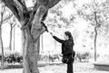
fading hearts by tateComment: I do love this. It was an 8 from me, and I'm not sure why I put it that low. :)
nicely seen and captured! |
Photographer found comment helpful. |
| 03/05/2016 07:19:30 PM |
horizontality by IreneMComment: Didn't think that glass shots could really impress me anymore. But I really find this wonderful! Congrats on the red! |
Photographer found comment helpful. |
| 03/05/2016 07:19:00 PM |
|
Photographer found comment helpful. |

| 03/05/2016 07:07:26 PM |
|
Photographer found comment helpful. |
| 03/05/2016 07:06:43 PM |
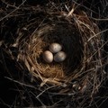
spiritedby PennyStreetComment: I think this would be a lot more interesting cropped right above the bowl. (I had to scroll down to comment, and it just was so much nicer, imo.) |
Photographer found comment helpful. |

| 03/05/2016 07:05:33 PM |
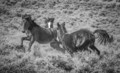
Sleeping in the Shadowsby MaryOComment: wonderful shot -- but the processing isn't helping it. Especially because it created a weird halo line around the bear on the left. I know it sounds picky, but it's the type of problem that isn't natural and sticks out to me. -6- |
Photographer found comment helpful. |

| 03/05/2016 07:03:35 PM |
herby kichuComment: I do like negative space, but I don't think it helps on this one. It's an interesting face, but I think the extra space distracts from it. -6- |
Photographer found comment helpful. |
| 03/05/2016 07:01:36 PM |
Sunlight by RefocusedComment: Loving the shot -- but it looks like you had problems burning the background. Try bringing it into photoshop and selecting brightness/contrast and increase the brightness and decrease the contrast significantly. You'll see you have lines around the ears and on the background above the cat. I'm just pointing it out because it's obvious on my screen. 6 as is, 8 if it didn't have the problems. |
Photographer found comment helpful. |
| 03/05/2016 06:53:50 PM |
Window napby pmichaudComment: I wonder if this would be more interesting cropped up a bit from the bottom? Love the feet. Nice catch. -7- |
Photographer found comment helpful. |
| 03/05/2016 06:53:00 PM |
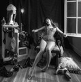
rage against the dying of the light by tangueraComment: I'm really wanting to love this one, but it's just not hitting me for some reason. I'm wondering if having more of the window/door visible. Or perhaps more to the right -- more of the shadow. Or cropped significantly up from the bottom. I think it's just because the arm and the hair and the light is fascinating, but the whole middle part just gets muddled and loses the interest, simply because it can't keep up with the rest.
Just thinking out loud, because I really wanted to find out why it didn't work for me. -6- |
Photographer found comment helpful. |
Home -
Challenges -
Community -
League -
Photos -
Cameras -
Lenses -
Learn -
Help -
Terms of Use -
Privacy -
Top ^
DPChallenge, and website content and design, Copyright © 2001-2026 Challenging Technologies, LLC.
All digital photo copyrights belong to the photographers and may not be used without permission.
Current Server Time: 07/08/2026 09:12:52 PM EDT.