| Image |
Comment |
| 12/07/2003 02:16:39 PM |
Waiting for the Elves by dsidwellComment: I like the contrast range you used here -- dark enough to add some moodiness, not so dark as to be scary, enough contrast to see the details. |
 Photographer found comment helpful. Photographer found comment helpful. |
| 12/07/2003 02:13:48 PM |
Calm Dayby Crafty SueComment: Gee, looks like about a 15 mph breeze to me. But the setting is calm ... |
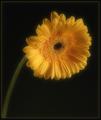
| 12/07/2003 02:09:19 PM |
softby agwrightComment: Excellent lighting/exposure control to maintain highlight detail on all but MAYBE one petal; just sharp enough to see the detail. |
| Photographer found comment helpful. |
| 12/07/2003 02:04:25 PM |
Soft Stillby MWittComment: That's a pretty good diagonal composition, with contrasts in color, texture, and shape. I think I'd put a 2-10 pixel black border on it though, I think it would tie it together better than the default gray on the DPC page.
When I first saw it I thought it might be in water -- you might want to try it again in a tray, with the stones covered by a 1/4 inch or so of water. |
| Photographer found comment helpful. |
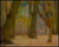
| 12/07/2003 01:59:18 PM |
Birchesby amsmythComment: I'd add more contrast, but a nice shot anyway. |
| 12/07/2003 01:57:01 PM |
Nature's filterby willemComment: Excellent capture -- I usually make shots like this a bit darker and contrasty, but that's definitely a matter of personal taste (and sometimes monitor adjustment). |
| 12/07/2003 01:53:33 PM |
Alex, through the shower doorby DiamondPeteComment: Interesting and creative use of a "filter" requiring no adapter, even for a point-and-shoot camera. Maybe a little less glare from the upper right would soften the reflections off the glass, but overall I like it. |
| Photographer found comment helpful. |
| 12/07/2003 01:48:39 PM |
Orange Lilyby Spork99Comment: The hints of other colors around the edges turn this into a complete floral still-life, not just a flower macro. I'd be tempted to run a canvas filter on it -- to me it has the look/feel of an oil painting while remaining photographic. |
| Photographer found comment helpful. |
| 12/07/2003 01:44:22 PM |
Pretty In Pinkby sagestudioComment: Based on comments on my entry, I'm guessing you have some "too sharp" comments. I like it because I think you're using color (rather than blurriness) as the "softening agent," and I like seeing people try different techniques. Cute photo too! |
| Photographer found comment helpful. |
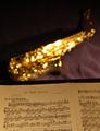
| 12/07/2003 01:34:32 PM |
"In The Mood"by DrakeComment: I like the idea ... I think I'd have tried a taller, skinnier arrangement so only one page of the sheet music shows, or else all the way horizontally so you see the top of both pages. On my monitor, the brightest highlights on the sax don't quite fit "the mood." |
| Photographer found comment helpful. |
Home -
Challenges -
Community -
League -
Photos -
Cameras -
Lenses -
Learn -
Help -
Terms of Use -
Privacy -
Top ^
DPChallenge, and website content and design, Copyright © 2001-2026 Challenging Technologies, LLC.
All digital photo copyrights belong to the photographers and may not be used without permission.
Current Server Time: 06/27/2026 06:03:52 AM EDT.