| Image |
Comment |
| 07/04/2004 03:03:57 AM |
d70.by the-O-sterComment: That's some serious-looking photography going on there .... |
| 07/04/2004 03:02:52 AM |
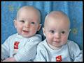
got twins?by soniecatComment: Pretty hard to get a decent baby picture sometimes ... to "double-dip" like this seems like taking maximum advantage of a rare stroke of luck. |
 Photographer found comment helpful. Photographer found comment helpful. |
| 07/04/2004 02:59:56 AM |
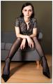
Veroniqueby sahkoComment: Unusual pose (for "portrait") works with the geometry and coloring of your background elements, plus excellent lighting. |
| Photographer found comment helpful. |
| 07/04/2004 02:57:07 AM |
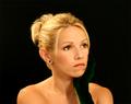
Glowingby lizzyc3Comment: Her emotions seem a bit ambiguous to me ... she could be saying "don't take a picture NOW!" Or ... possibly having a great ol' time :) |
| Photographer found comment helpful. |
| 07/04/2004 02:54:16 AM |
Low-Key Rembrant Lightby JoelHSmithComment: I don't thnk your color scheme quite goes with your title (more blues than reds/browns to me), nor is it quite as low-key (a "dangerous" thing to try at DPC anyway), but I like it quite a lot the way you have it. |
| Photographer found comment helpful. |
| 07/04/2004 02:49:59 AM |
Amyby sagestudioComment: The "nimbus" is a little overly-bright to me, but a good idea/effect anyway; like your background. |
| Photographer found comment helpful. |
| 07/04/2004 02:45:44 AM |
|
| Photographer found comment helpful. |
| 07/04/2004 02:42:55 AM |
My Love...by toddheadComment: I'd like to see how this looks with the hair in the back either more blurry, or the hair sharp throughout. Maybe because it holds the brightest highlights it somewhat draws the attention away from her face. Or perhaps burning it a little so it would fade into the background more smoothly would work instead. I think I'd also try a vertical crop of the same shot. |
| Photographer found comment helpful. |
| 07/04/2004 02:36:58 AM |
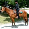
Samantha's Challengeby NeuferlandComment: If her head were tipped back a bit, there would be less shadow on her face; right now we have a slightly better view of the horse.
Unless ... the horse IS Samantha ... |
| Photographer found comment helpful. |
| 07/04/2004 02:31:14 AM |
Tamaraby PhilosComment: Fine lighting to isolate her face. I wish there was just the tiniest bit more contrast between her irises and pupils so her eye color would show more; that could be a monitor issue though. A square crop might/might not make an even stronger "portrait" image. |
| Photographer found comment helpful. |
Home -
Challenges -
Community -
League -
Photos -
Cameras -
Lenses -
Learn -
Help -
Terms of Use -
Privacy -
Top ^
DPChallenge, and website content and design, Copyright © 2001-2026 Challenging Technologies, LLC.
All digital photo copyrights belong to the photographers and may not be used without permission.
Current Server Time: 07/06/2026 09:43:39 PM EDT.