| Image |
Comment |
| 07/04/2004 11:54:59 AM |
My Brother Bobby indianzfanComment: Lighting, exposure, background and focus are all good ... I might try cropping just a little tighter. |
| 07/04/2004 11:52:31 AM |
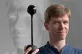
Self-Portrait in the Age of Web-Cams and Digital Projectorsby magnusComment: When they said "studio" portrait I don't think they meant George Lucas' ... very clever setup. Must have been hard to get adequate lighting without washing out the projection.
I wish we could see some photographer's notes so you wouldn't need the long title though ... |
 Photographer found comment helpful. Photographer found comment helpful. |
| 07/04/2004 11:47:59 AM |
Untitledby EddyGComment: On my monitor it just loses the highlights in the right-foreground, but good exposure overall. Your simple setting is pretty studio-like :) |
| Photographer found comment helpful. |
| 07/04/2004 11:44:02 AM |
My Loveby Thousands_FallComment: Good attempt at a moody. evocative look; on my monitor it could use maybe just a touch more contrast. |
| 07/04/2004 11:38:40 AM |
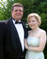
Bill & Kimby TooCoolComment: It's usually hard to get a decent portrait outdoors, against a background of foliage, wiht a lot of backlighting -- you've done far better than most under the circumstances. Good combination of softness and detail, too. |
| Photographer found comment helpful. |
| 07/04/2004 11:35:02 AM |
Great Grandpa,Chuck and his story book.by camelotnorthComment: This pose/composition seems a little "loose" to me, probablu due to trying to show him in the "environment." I usually think of a "studio portrait" as a bit tighter and concentrating a little more on the face. Given what you wanted to show here, I think you did a good job with the lighting, focus, etc. |
| Photographer found comment helpful. |
| 07/04/2004 11:26:33 AM |
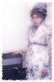
1860's in technicolorby ladpupmoeComment: I like the overall effect, good job conveying an "old-timey" look ... the "distressed" border is a good idea but maybe just a little too much; I'd like to compare with a version with a less aggressive application of the effect. |
| Photographer found comment helpful. |
| 07/04/2004 11:22:19 AM |
Brideby grigrigirlComment: From the angle of her head I get the impression that there might have been just a LITTLE too much picture-taking going on :)
Good exposure; I like the effect of the veil blending into the background. |
| 07/04/2004 11:18:56 AM |
|
| Photographer found comment helpful. |
| 07/04/2004 11:17:00 AM |
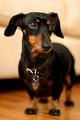
It's In The Eyesby K-RobComment: Lighting, focus, angle are all pretty good. At first I found the blurred line in the background (counter's edge?) a distraction and thought it would look better with a smooth gradient, but since it's right on a line with the eyes I guess it may also serve to draw the attention there ... it would be interesting to try evening out the BG to see how it looks. |
| Photographer found comment helpful. |
Home -
Challenges -
Community -
League -
Photos -
Cameras -
Lenses -
Learn -
Help -
Terms of Use -
Privacy -
Top ^
DPChallenge, and website content and design, Copyright © 2001-2026 Challenging Technologies, LLC.
All digital photo copyrights belong to the photographers and may not be used without permission.
Current Server Time: 07/07/2026 08:57:02 AM EDT.